
Rebranding
Millie Watson | Fashion Promotion | FMP

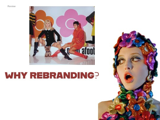
Can an old iconic brand be rebranded to serve a new younger customer?
fmp proposal
| Context
Context
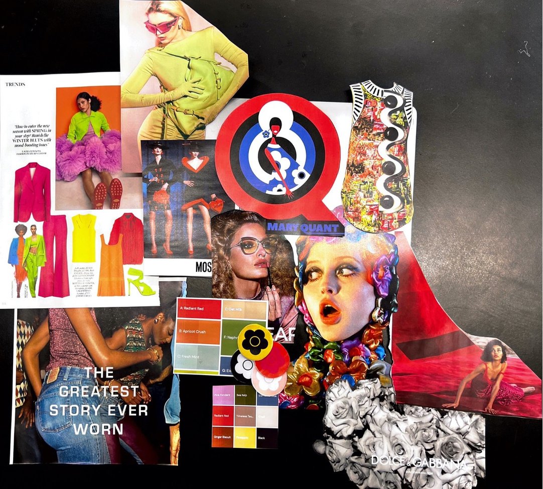
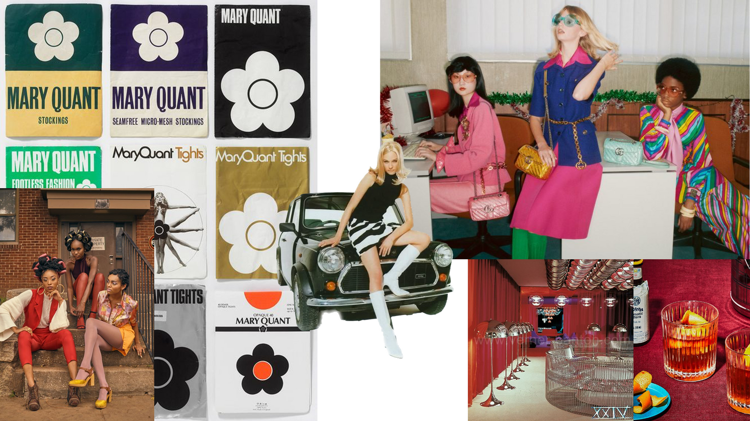
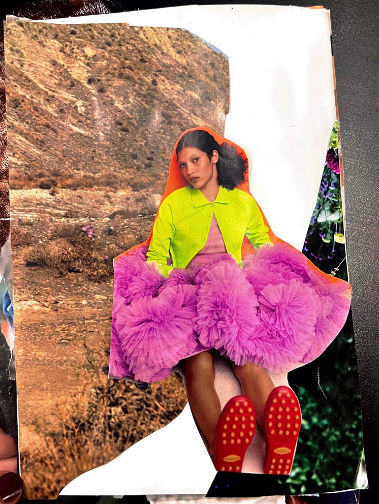
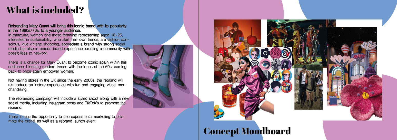
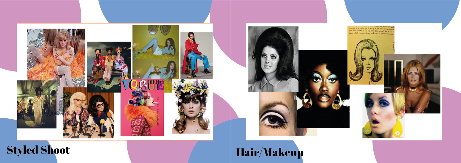
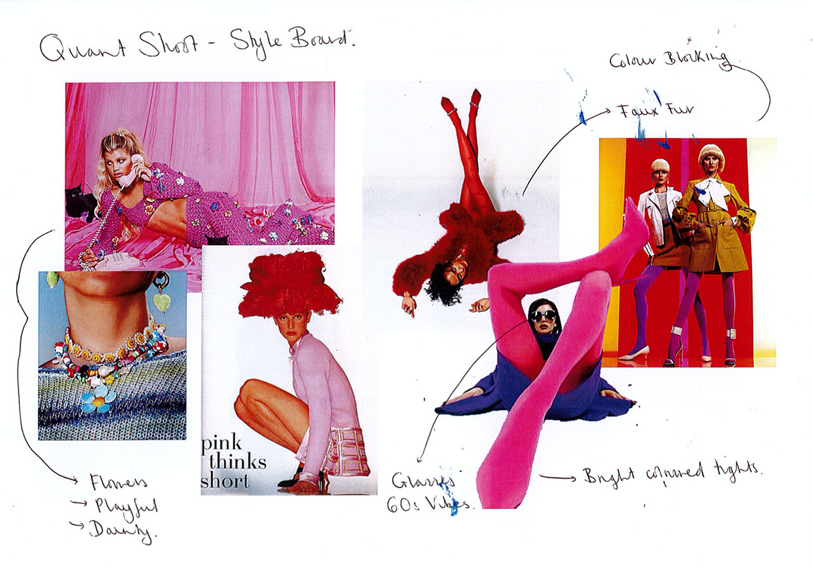
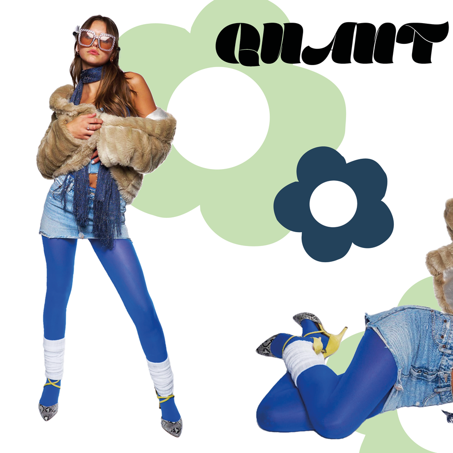
After looking into brands with rebranding potential I decided on Mary Quant. I looked through some magazines and online to find some images, putting together a board of colours, clothing and ideas that bring across my vision for the brand. This helped me to understand that there is a future for Mary Quant as a brand if I was to take it into a new direction with a new, young audience in mind. I looked for images that had a retro 60s feel but wanted to make sure the images were still relevant to a more modern audience, having a mix of bright colours, retro tones and modern shapes of clothing was the best way to bring this across.
Concept Moodboard
SWOT ANALYSIS: MARY QUANT
- Strong heritage
- Revolutionized fashion for women
- Affordable for women
- Taught women how to make their own clothes
- Store front of the Bazaar looked through to the clothes being made
- Relevant in British pop culture.
- Has a retro feel that is popular at the moment with the obsession with vintage pieces and thrifting.
- Popular in Japan but not the UK.
- Centered around fashion being affordable for the young.
- Little to no online presence
- Do not stay on trend with social media, no TikTok
- Clothing is not fashionable, sells jumpers, heavy reliance on the logo.
- No brand experience
- Do not market off their heritage in trendsetting and revolutionary designs.
- No stores since 2012
- No catwalks
- Even the makeup isn’t talked about.
- Over saturated market, other brands are already relevant and current with a younger audience
- Since Quant has not produced clothes since the 60s/70s there is not much to market off, the only archives are from the 60s and not more recent.
- Due to the time Mary Quant has been less relevant as a brand people may have lost interest
- There is not a loyal customer base now.
Strengths
WEAKNESSES
Opportunities
THREATS
- Gain relevance in a younger market
- Reaffirm Mary Quant as an iconic British Designer in a younger generation
- Pop up at British events
- Create stores that show vintage pieces as well as sell limited edition collections
- Sell a Mary Quant experience that promotes sustainability and creativity.
- Go into different industries such as the bar/drink industry to sell a creative lifestyle, alike the one she lived when she was young.
- Launch party for brand
- Concepts for fashion shows
- Use Guerrilla Marketing to raise awareness of the brand again, such as driving a Mary Quant car around London/ UK.
Context- Mind map on rebranding.
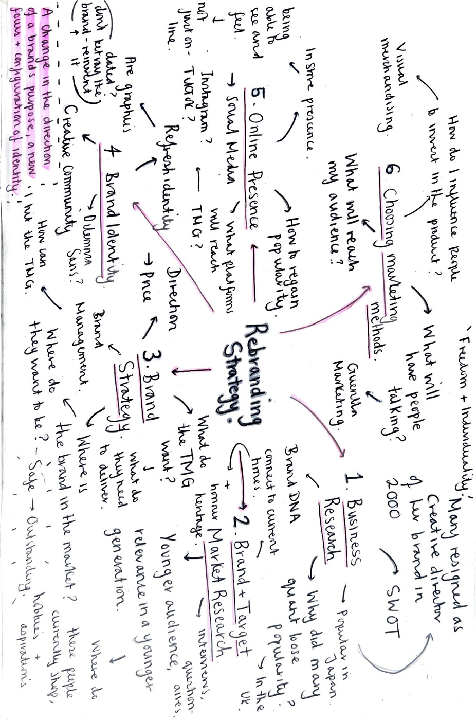
I created this mindmap to explore the process of rebranding visually, coming up with questions that I should be asking myself along the way. This gives me a base to come back to and assess my work as I carry on exploring Mary Quant as a brand and producing a customer profile. I found that with this task I was able to express myself easily and get out all my ideas, if everything is online then I can get overwhelmed, having it written down in-front of me makes me understand the process clearly.
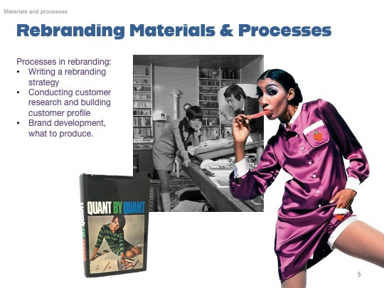
Rebranding Strategy
- Business Reason
- Research brand and target market
- Find Brand Strategy
- Build Brand Identity
- Build online presence
- Understanding marketing methods
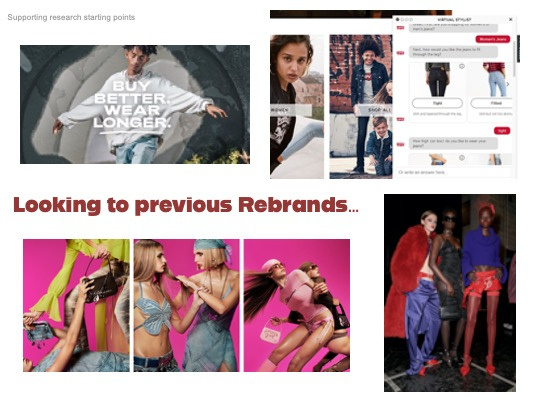
Examples of successful rebrands/revitalisation to reach a younger audience:
- Blumarine- comeback, marketing off of the Y2K trend.
- Levi's (reaching GenZ)
- Fiorucci.
SUPPORTING TRENDS
Research
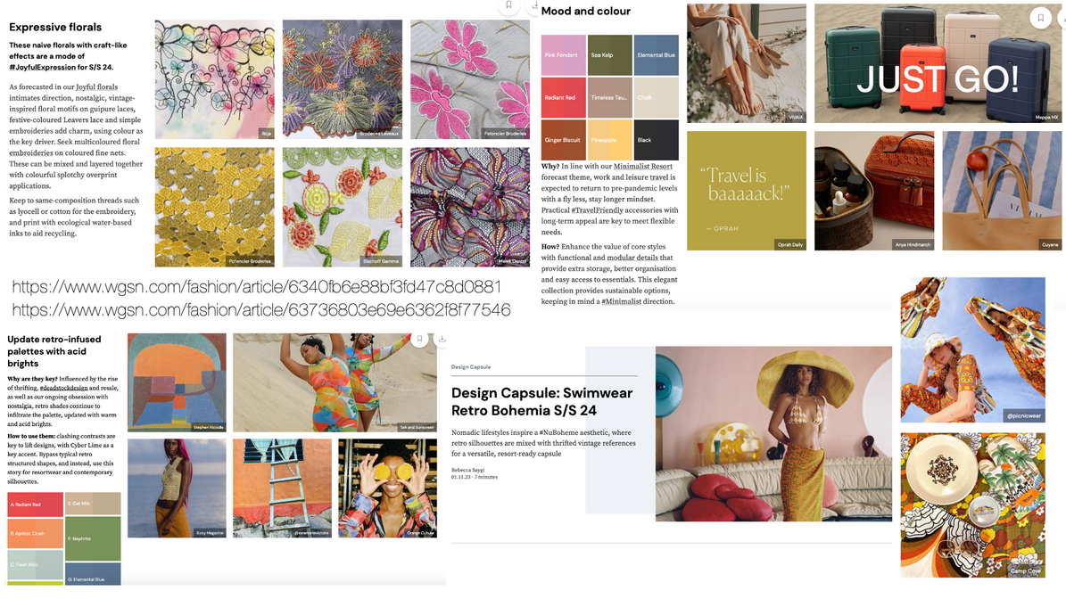
I went to WGSN to have a look at some predicted trends, particularly for S/S 24, to have a look at whether these trands could reflect my brand and back the idea of Mary Quant becoming relevant again.
All images from WGSN
Where could the rebrand go?
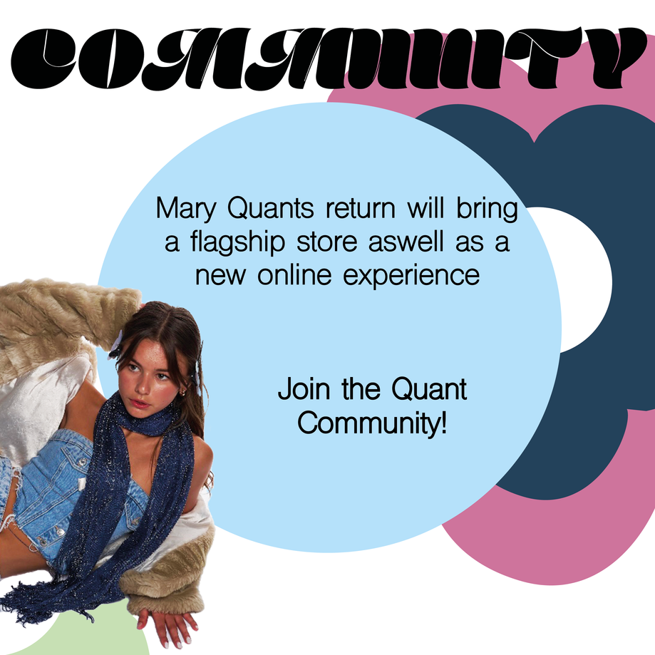
- Mary Quants Rebrand will see the brand introduced to a younger market in Britain, enlightening their new audience on a retro playfulness unlike anything they have seen before.
- The brand will honour its heritage in changing the face of women's wear, moving away from producing merchandise to producing limited collections of bold designs, each branching out with a theme.
- The brand will gain a new recognition by creating a community of creative individuals, in which events will be held.
- The rebrand will see Mary Quant put sustainbility at its centre influenced by a new culture of up-cycling and thrifting.
- A flag ship store will be introduced with a focus on in person experiences, with eye catching visual merchandising that increases footfall.
- The rebrand will reach its target market through a social media relaunch, a start as fresh as a daisy.
- Finally the visual identity of the brand will be refreshed to match this new start for the brand, paying homage to the brands heritage whilst adapting for future customers.
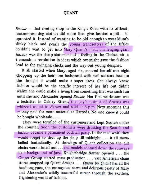
Prologue to Quant by Quant
Reading Mary Quants autobiography was crucial to my understanding of the brand and Mary's attitude.
The prologue in itself expresses the brands purpose of serving the younger generations and allowing young women to trend set in a way of expressing fashion in their won way.
It also shows how the brand is centred in fun and having a good time as well as enjoying the fast life.
A place were business, fashion, music and fun is combined for the audience to truely feel part of the brand.
Building Mary Quant
A New Customer
- Who is the rebrand aimed at?
- Primary research
- Interviews
- Create a Customer Profile
Planning: Playing with layouts

Retro Playfulness
Creative Sustainability
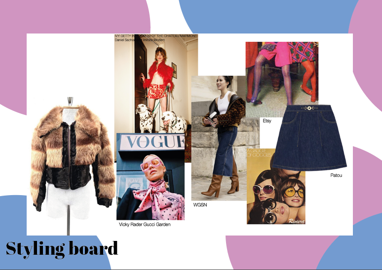
Above are some experiments for the vibe of the rebrand, looking at bright fashion imagery and some images from Mary Quants popularity in the 60s, looking at how this vibe could reach a younger audience. I think that although the youthful look of the brand in the 60s worked well at the time, and also reached the audience of teenagers, women in their aged 18-25 do not want to look childish, but sophisticated and put together.
The principle of Mary Quant, creating clothing that makes women feel empowered, shall remain but this time will adapt to the times, whilst still capturing its vintage essence.
This is something that I want to capture in my imagery, the brands ability and aim to empower women and give women what they want in terms of style and experiences.
Reference list
Anon, (2019). Exhibition stand: Fritz Hansen & Louis Poulsen / VP1191-00-B-D13 - Verner Panton - Official. [online] Available at: http://www.verner-panton.com/en/werk/messestand-fuer-fritz-hansen-und-louis-poulsen-vp1191-00-b-d13/ [Accessed 2 May 2023].
Joe , T. (n.d.). Old Fashioned Cocktail.
MARY QUANT COSMETICS LTD. (n.d.). ABOUT THE MARY QUANT BRAND|MARY QUANT COSMETICS LTD. [online] Available at: https://www.maryquant.co.uk/company/profile.html.
Peckmezian, M. (2017). GUCCI Christmas Campaign.
Thezeallife.com. (2023). Available at: http://www.thezeallife.com/wp-content/uploads/2017/10/The-Zeal-Life-_6.jpeg [Accessed 2 May 2023].
Twilight (2010). LEARNING CURVE ON THE ECLIPTIC: Arty Farty Friday ~ Mary Quant. [online] LEARNING CURVE ON THE ECLIPTIC. Available at: http://twilightstarsong.blogspot.com/2010/07/arty-farty-friday-mary-quant.html?m=1 [Accessed 2 May 2023]
Pecha Kucha
Presentation
Pecha Kucha Reflection
The Pecha Kucha was a successful task due to the feedback I got to take my project forward. I was given feeback on how to make my slides more cohesive, and what to research going forward. I was told to look at the current website of Mary Quant and why this needs updating. I also need to investigate to why the brand became irrelevant in the UK aswell as looking into the number of why it is sucessful in the UK. I also need to speak to some young people on whether they have heard of the brand Mary Quant and if so what they think of it. I will also reach out to some creative brands to see if their female employees could fill out my survey on Women's Fashion. The challenging part of the presentation was how quickly the slides changed, since each slide was only 30 seconds long which meant I had to be quick and concise with what I was saying, but also could not explain my research in great depth, but spoke about this afterwards.
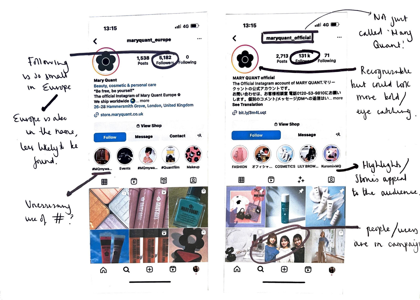
website presence analysis
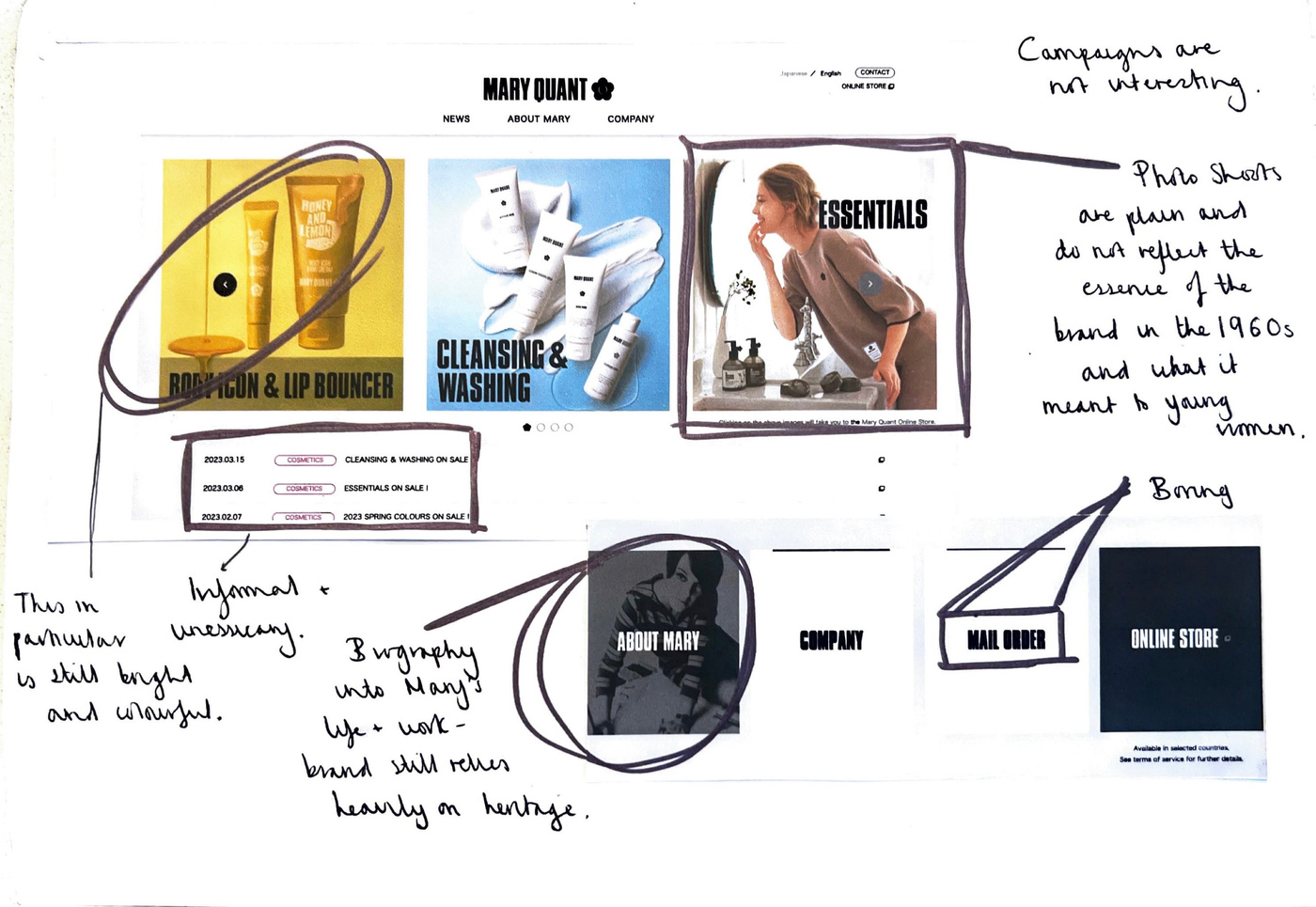
Research
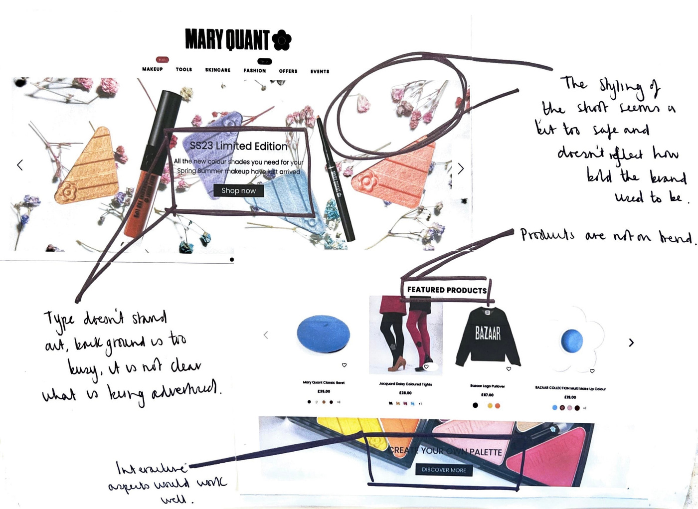
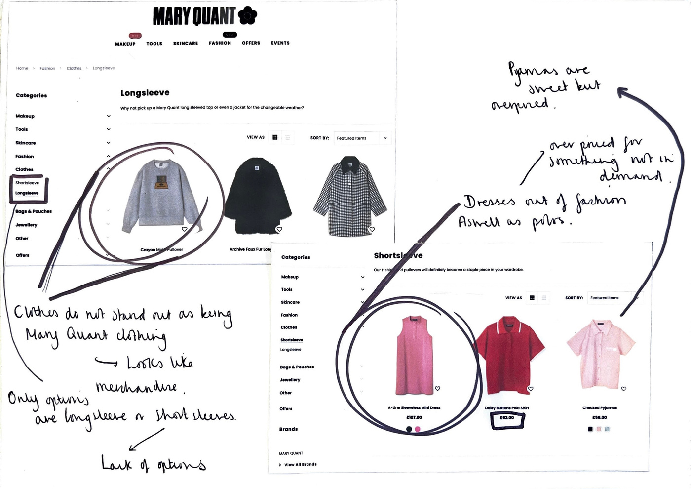
Social media presence
There is a huge opportunity to create a better social media experience for Mary Quant in the UK and reach a young audience who will love the retro and empowering message of Mary Quant for women.
Understanding Mary quant
Research
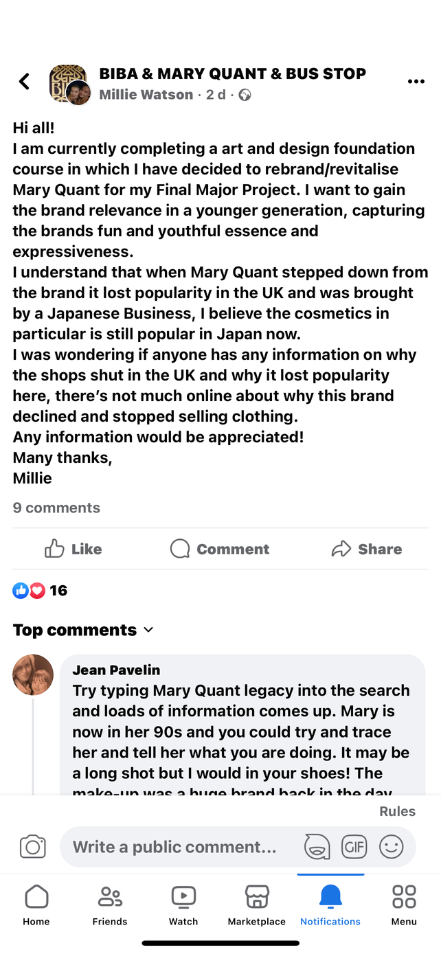
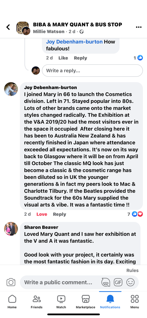
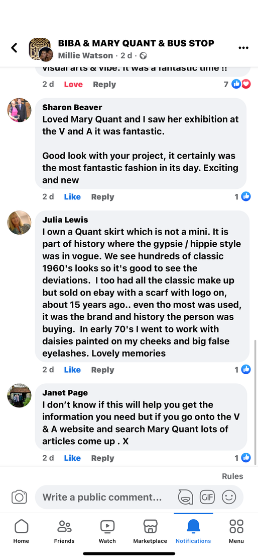
To understand the brands popularity in the 1960s/70s and why the brand no longer produces bold and trendsetting garments I reached out to a Facebook group called Mary Quant and Biba Bus Stop, in which women were reflecting and sharing their experiences of the swinging sixities mod style, how they felt in this time and what they miss about this fashion. It felt like a place where people could be nostalgic about their younger years, and they seemed very fond of these memories, some women had even worked for Mary Quant.
Beyond the streets london
Ways of presenting work
Research
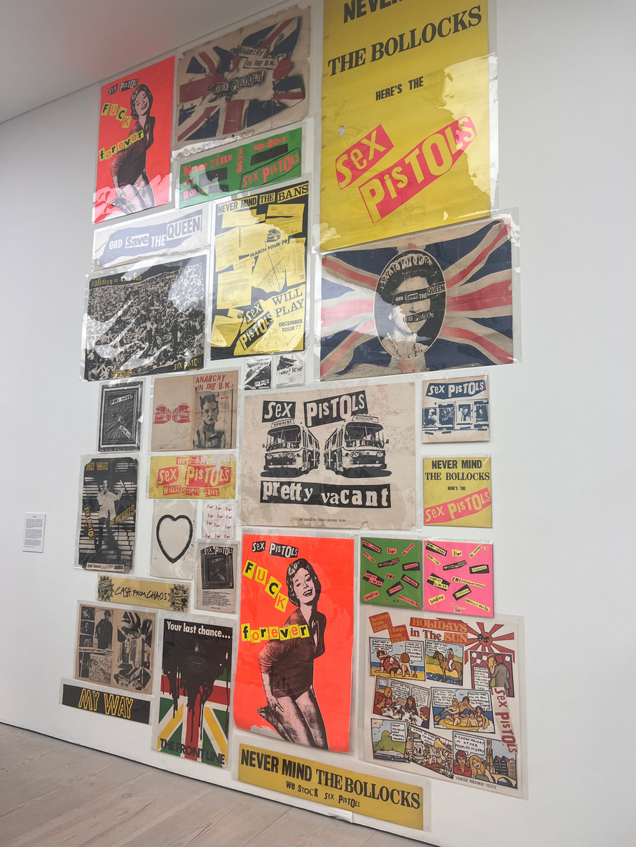
When looking around Beyond the Streets London at the Saatchi gallery I looked in particular at how work had been laid out in a way that was eye catching and would leave an impression, anything that I could use as ideas for when I am promoting the Mary Quant Rebrand. I paid attention to fashion from past decades andhow this was displayed since this would work with acrhive pieces from Mary Quants old collections. I also looked at how British designs where presented, such as the Sex Pistols God Save the Queen by Jamie Reid, and how britishness is presented through art and fashion.
The first piece of work I saw when I walked into the gallery was a group of televisions displaying past images of life in Britain, I thought the display of these videos was interesting because of how each television stacked on top of each other was playing a different clip but the overall imagery came together. Jamie D'Cruz uses his cinematography to capture music scenes such as hiphop and garage and in this case, uk graffiti. I thought this display on the televisions could be a good way to display behind the scenes shots of shoots or archive videos of Mary Quant.
Beyond The Streets London [exhibition], Saatchi Gallery, London, 17th February- 9th May
Jamie D'Cruz
Wellcome collection- Objects in stereo
Jim Naughten's collection of photographer that when using a stereoscope the photographs became 3D. I thought this was a great way to make an exhibition interaction as just walking around looking at these photos without the interactive element would be a bit tedious and would bore quite a few people. This reminded me of VR and the benefits that brings to brands due to the ability to wow people and make people feel immersed in an experience rather than a passive receiver of the exhibition.
Jim Naughten: Objects in Stereo [exhibition], Wellcome Collection, London,24th November 2022- 23rd April 2023.
Experimenting with zines
Practical Skill
I was pleased with my first three pages on the zine experiment, I think I was able to bring across the essence of bringing Mary Quant to a younger, modern audience through the fun imagery, blending images from Mary's designs as well as new imagery. I also used text, in particular a part of Dazed Magazine in which people were recommending places to eat and go, which added a sense of community to the magazine which I wanted to make sure to bring across with my rebrand. Swapping zines with other people on my table took me out my comfort zone since I wanted to do their project justice, giving someone else your work can be daunting too. I really liked some of the imagery Jessie picked for the zine, in particular the tweed two piece, due to the tones it seems both retro and futuristic at the same time which is relevant in todays climate in which we are heading to an extremely digital society whilst holding nostalgia for the past.
From Jessie's double page spread I brought in the idea of nature which she hinted at and really empathised the foflowers which is a key image when thinking of Mary Quant as a brand. However I would definitely focus on making those last two pages and back page less plain in the background and more layered and bold.
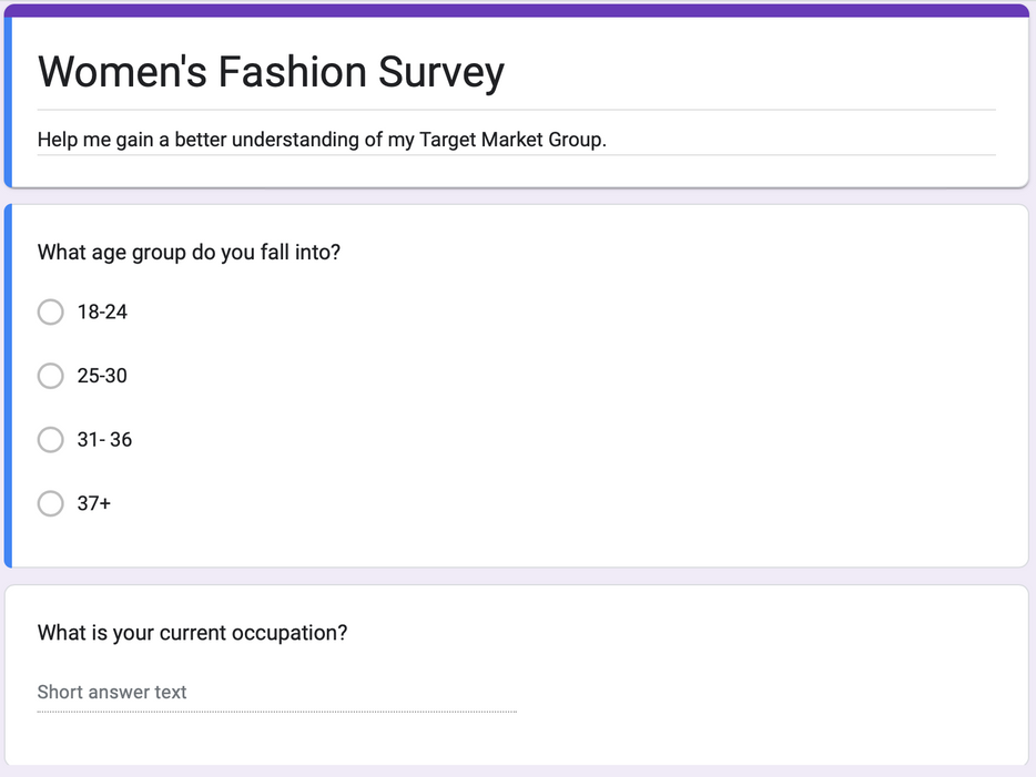
Target Market Group
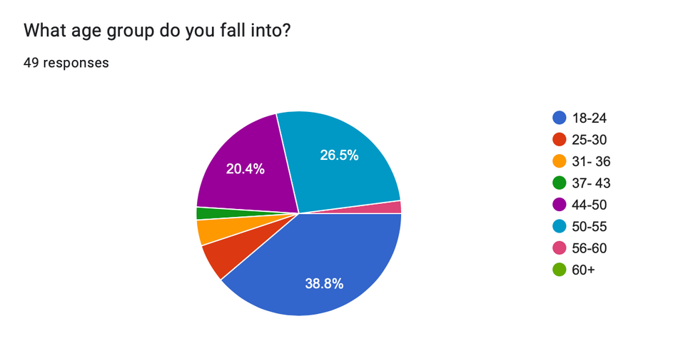
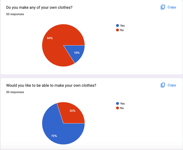
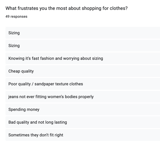
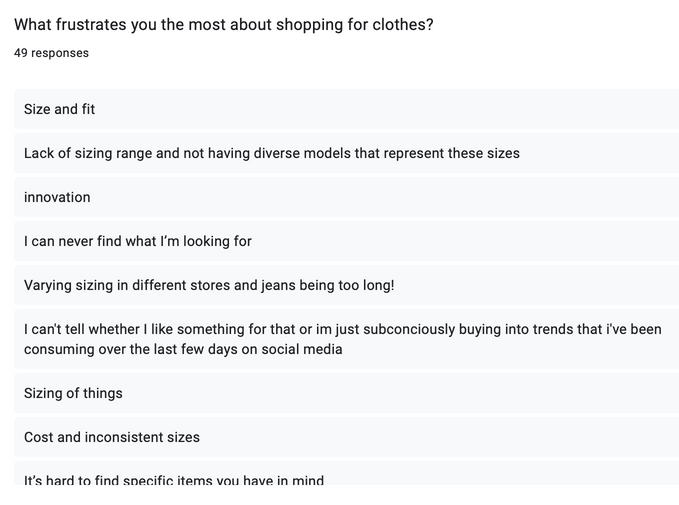
I created a survey to judge awareness of Mary Quant as a brand and understanding my target market's preferences when it comes to shopping, sustainability, pressure points and pricing of clothing. I sent my survey to women and those interested in women's fashion of all ages and was pleased to get 50 responses back from the ages of 18-60
Primary Research
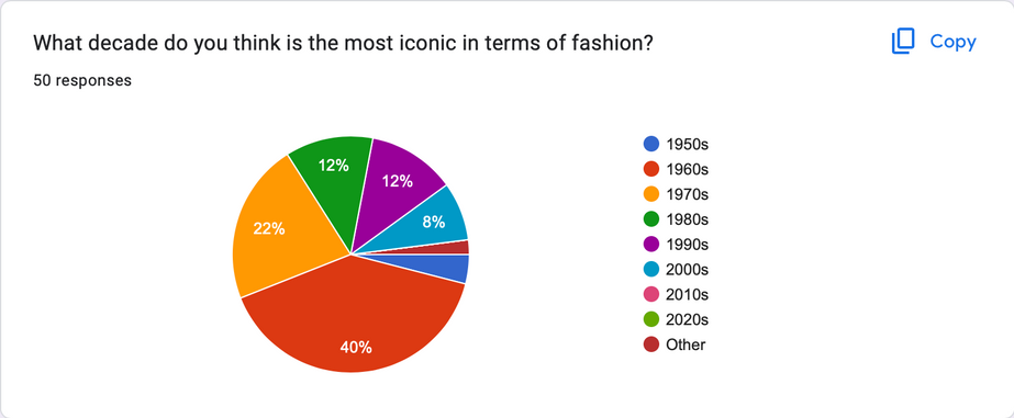
Audience believes the 60s/70s to be the most iconic decades in terms of fashion, which reflects a market for Mary Quant's return to the UK.
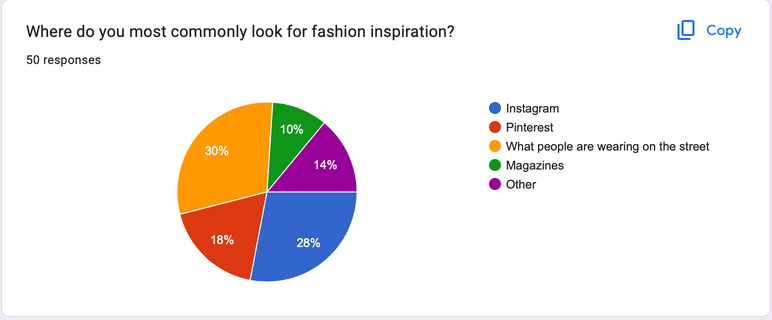
The largest number of people said they find their fashion inspiration from people they see on the streets, showing how the audience favours a real life experience over digital inspiration, however this is used aswell.
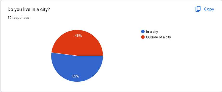
Most of the audience live in London or surrounding areas meaning the location for the Flagship store should be London.
The audience expressed that most do not know how to make their own clothes, or do make their own clothes, but would like to be able to do this, meaning there is an opportunity for the brand to provide a service and create a community.
When asking what frustrates the audience most about buying clothes and they expressed sizing, therefore Mary Quant has an opportunity to offer a customisation service in which size and style is both covered.
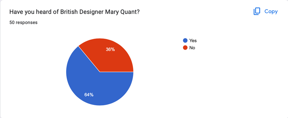
Most of my audience had an awareness of Mary Quant as a brand for her past work, but interestingly those who answered No were younger. Therefore there is the opportunity to raise awareness of this brand with a new audience.
Taking research forward
Planning
From my research I am going to explore possible directions to take the brand in terms of how it stands out from other existing brands.
- Mary Quant has a history in iconic designs that can be recognised in a younger audience and is known well by older customers.
- With the current interest in vintage items, Mary Quant stands well in providing a retro feel, even if the clothing produced in new collections takes modern shapes.
- There is an opportunity to create a creative community for women to share ideas, empower each-other and learn new creative skills.
- Customising clothing
- Mary Quant can branch out into other industries, music events (festivals), drinks and bars.
Research | Problem Solving
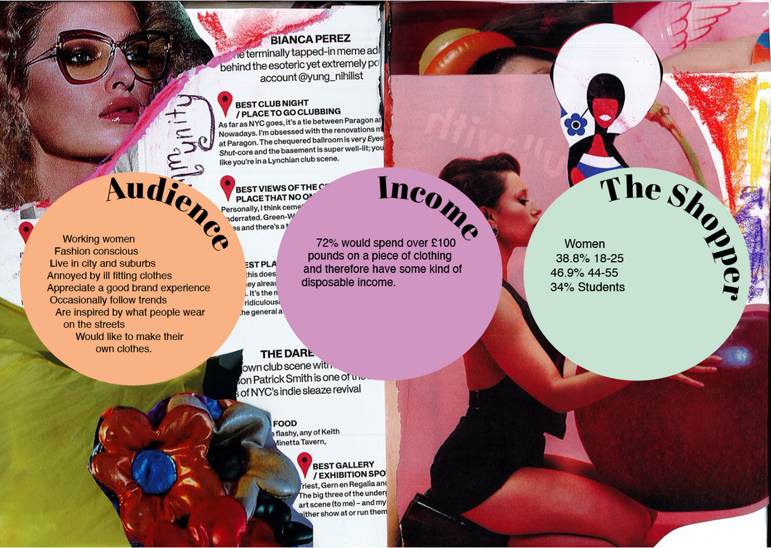
My target market board look at an overview of what I gained from my research, in terms of audience, their income and who the shopper is in terms of demographic.
Research | Problem Solving
Reference list
A Lady in London (2016). International Pubs in London - 7 London Pubs That Will Let You Travel. [online] A Lady in London. Available at: https://www.aladyinlondon.com/2016/04/international-pubs-london.html [Accessed 2 May 2023].
Eagle , J. (2019). Funkin Cocktails partners with Adargh on its Nitro Cans .
My Accessories London. (n.d.). Women’s Fedora Hats | Bags & Hair Accessories. [online] Available at: https://www.myaccessorieslondon.co.uk [Accessed 2 May 2023].
www.shffls.com. (n.d.). Check out felicity_grist’s Shuffles #festival #summer #summer2022 #glastonbury #glastonburyfestival #festivals #festivalvibes #neon. [online] Available at: https://www.shffls.com/en-GB/shuffles/5252137223142302739 [Accessed 2 May 2023].
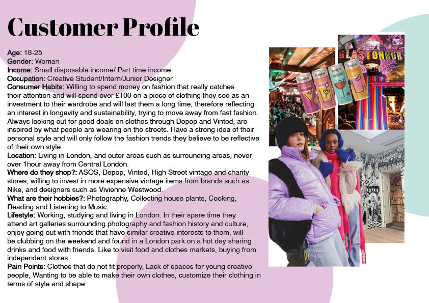
This customer profile takes a closer look at my main customer, who they are and what their interests are.
Presenting my treatment
Presenting
Reference list
Archilovers. (n.d.). The MIXc Kunshan (public Area Renovation Design) - Picture gallery 2. [online] Available at: https://www.archilovers.com/projects/259626/gallery?2536720 [Accessed 2 May 2023].
Bloglovin’. (2015). ANAIS MALI & ZUZU TADEUSHUK FOR VOGUE PARIS DECEMBER 2015 / JANUARY 2016 (PHOTOS DE MODE). [online] Available at: https://www.bloglovin.com/blogs/photos-de-mode-13810503/anais-mali-zuzu-tadeushuk-for-vogue-paris-4649587567 [Accessed 2 May 2023].
Vail, C. (n.d.). Tulip Festival in the Netherlands | Reflections Enroute. [online] Reflections Onroute. Available at: https://www.reflectionsenroute.com/tulip-festival-parade-netherlands-photo-essay/ [Accessed 2 May 2023].
Vouge (n.d.). Cetim dress and shorts, from 1966 Photo: Vogue.
Wiggins, W. (n.d.). Collage of 60s badges .
Reference list
chelsamander (n.d.). ✿ she’s a carnival ✿. [online] Tumblr. Available at: https://chelsamander.tumblr.com/post/76579139186 [Accessed 2 May 2023].
Design Scene. (2018a). Ni Ni, Sedona Legge & Stella Lucia for Gucci Fall Winter 2018.19 Eyewear. [online] Available at: https://www.designscene.net/2018/10/gucci-fw18-eyewear-colin-dodgson.html.
Design Scene. (2018b). Ni Ni, Sedona Legge & Stella Lucia for Gucci Fall Winter 2018.19 Eyewear. [online] Available at: https://www.designscene.net/2018/10/gucci-fw18-eyewear-colin-dodgson.html.
Johnson, K. (2020). Zendaya on her career in Vogue Australia’s March issue. [online] Mail Online. Available at: https://www.dailymail.co.uk/tvshowbiz/article-8032197/Zendaya-career-Vogue-Australias-March-issue.html [Accessed 2 May 2023].
MARY LENNOX. (n.d.). DOUGLAS 03. [online] Available at: http://marylennox.de/douglas-03 [Accessed 2 May 2023].
Stern , B. (n.d.). Jean Shrimpton with flowers in her hair photographed by Bert Stern
Presenting the treatment on the wall boards and collecting an understanding of my project from peers helped me to understand if my rebrand reaches in Customer, and that it is clear what the theme of the project is. Presenting visually on a board helped me to see my project coming to life a bit and I was able to understand my next steps.
I was given some good feedback from peers at what I could look at and in particular to find a secure unique selling point for the rebrand, making sure it stands out from other brands that are already on the market.
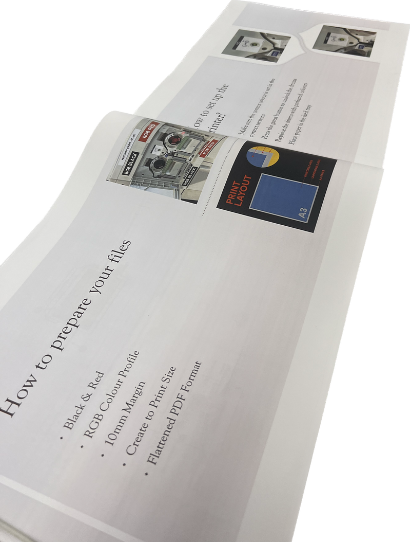
experimenting with RIso Print
Practical Skill
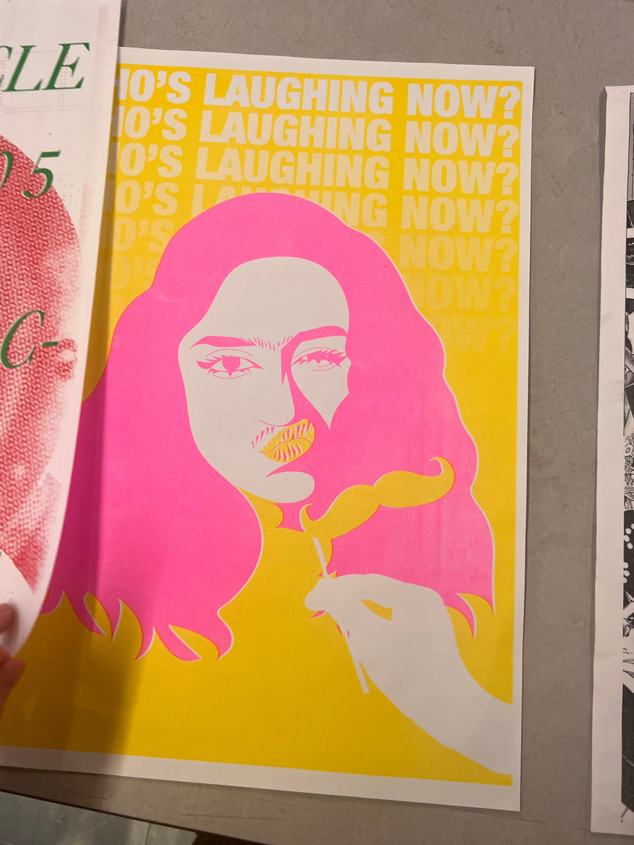
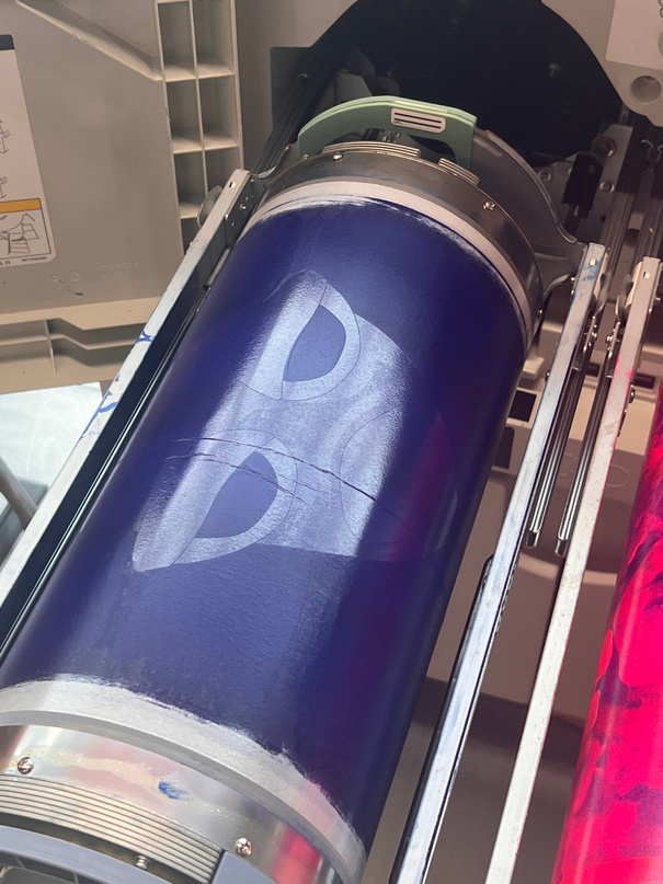
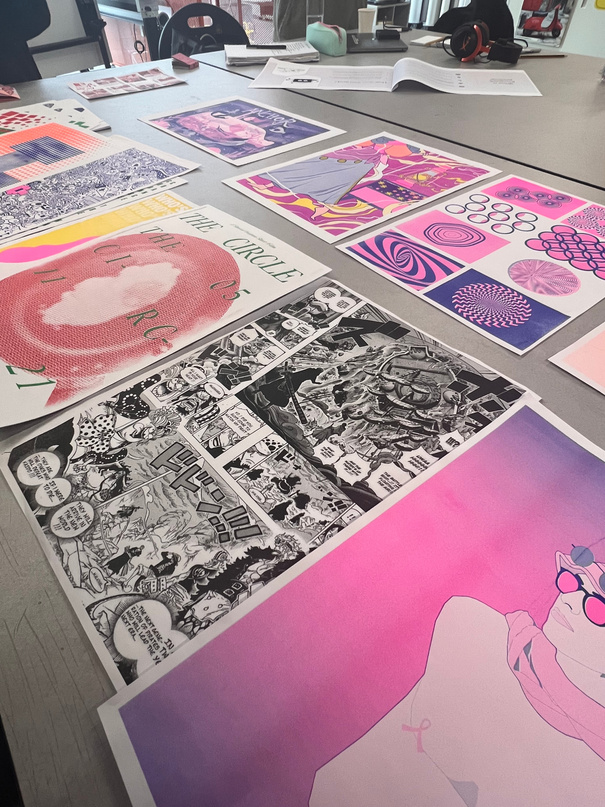
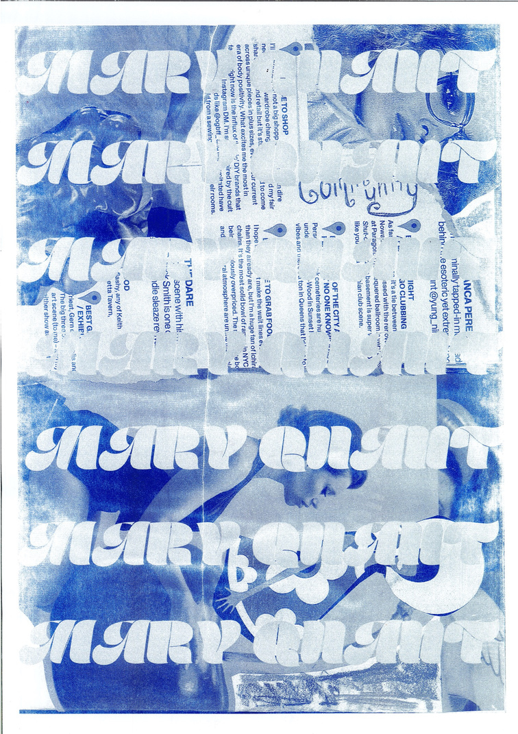
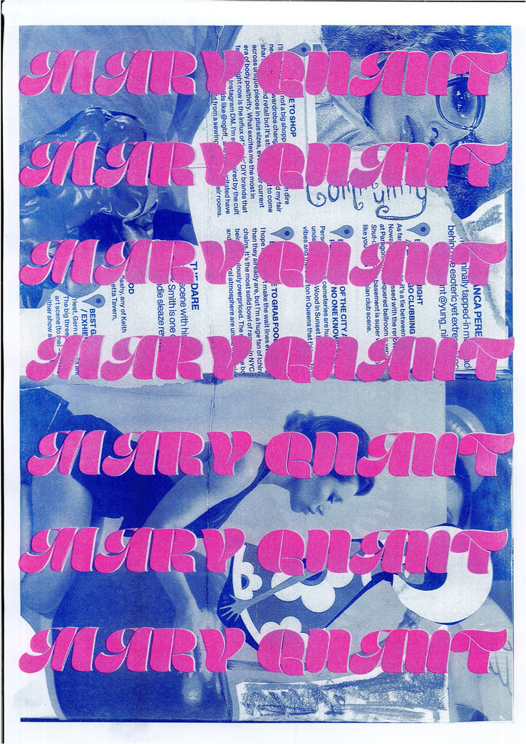
I went to the RISO printing workshop to explore ways of presenting my final outcomes such as any images taken in photoshoots when it comes to displaying my FMP. I found the workshop beneficial and used to the RISO printer to do some tests on what outcomes could look like, to do this I used an image on my zine with some layered typography on top, in the font 'Marshmellow' which I think matches my typography board for the Mary Quant rebrand. I loved the outcome produced by the printer due to the grainy texture the printer has, which reflects the 60s/70s and origin of Mary Quant as a brand, but the font and the imagery gives the poster a modern twist and makes sure the poster doesn't look like its completely mimicked the 1960s/70s.
In the future I would like to explore the idea of making a small zine or look book that could be handed to people when they enter the shop as a collectable or a keep sake, this would give something for people to talk about and gives people a physical part of the brand which not many brands do in a digital age.
If I did this experiment again I would look at using different colours that reflect the brand a bit more such as pink and orange or using brown as-well, even possibly layering colours to create a new colours that are less vibrant.
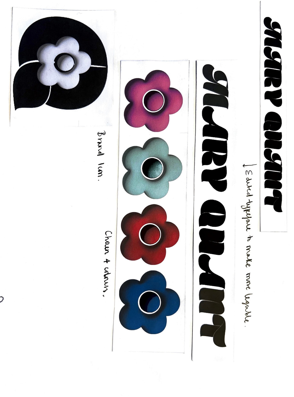
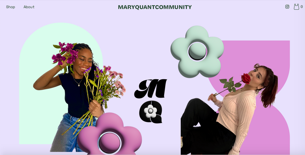
re-defining mary quant as a brand
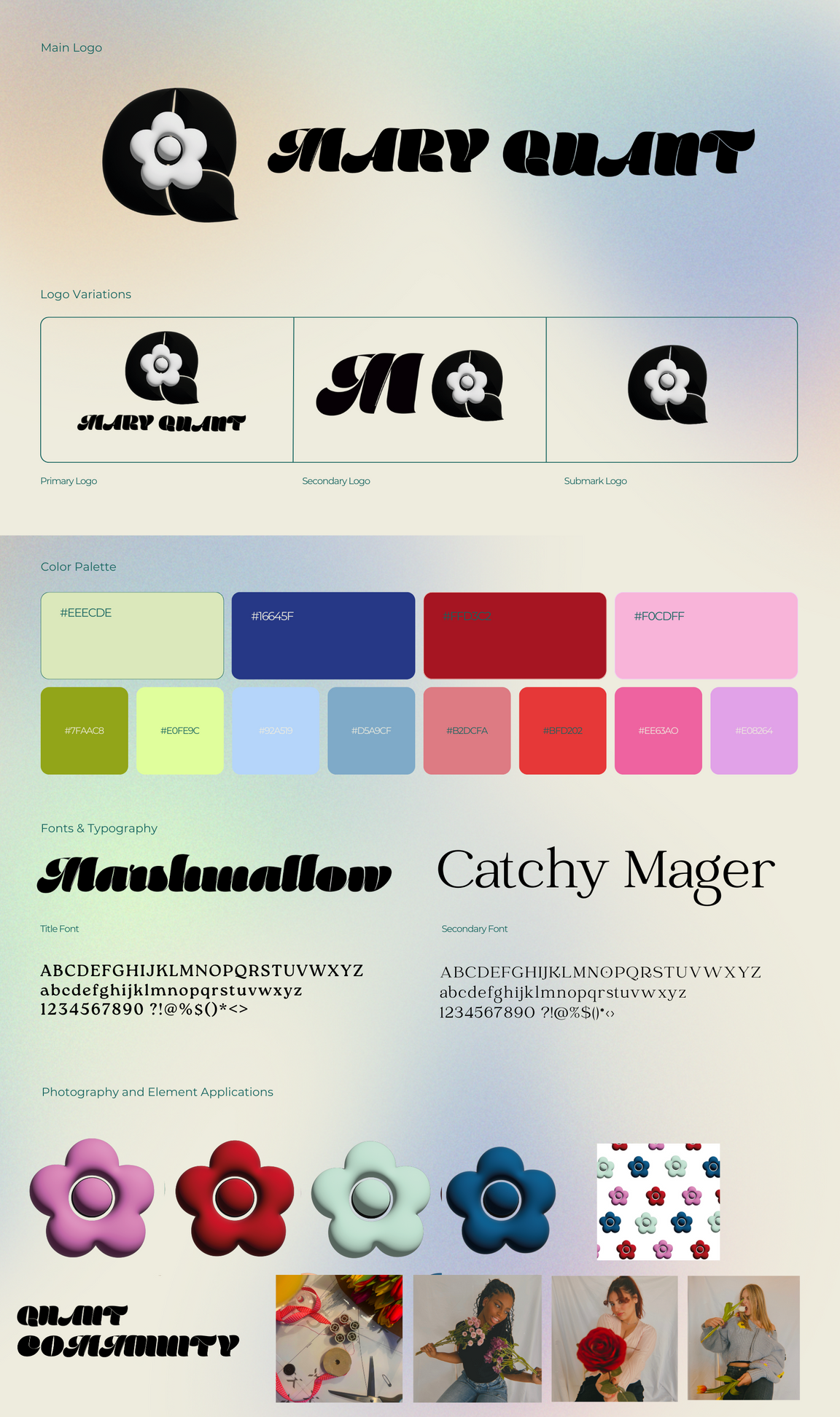
Creating a new brand identity
Problem Solving
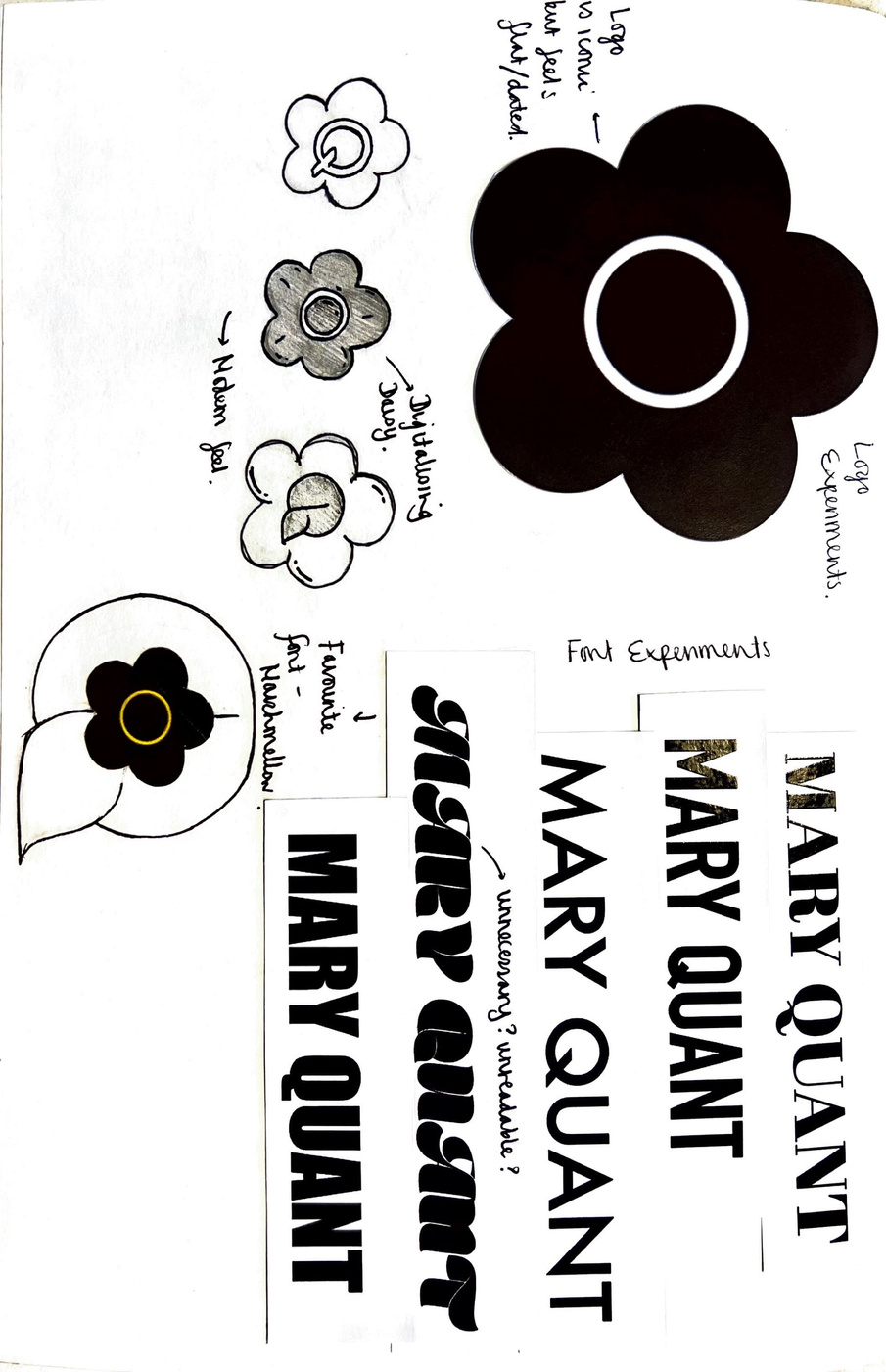
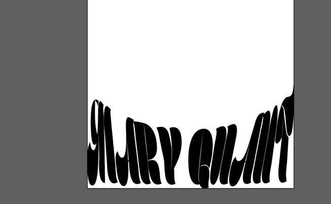
On this page I was experimenting with different type faces after deciding the one on the website didn't reflect the brands big personality.
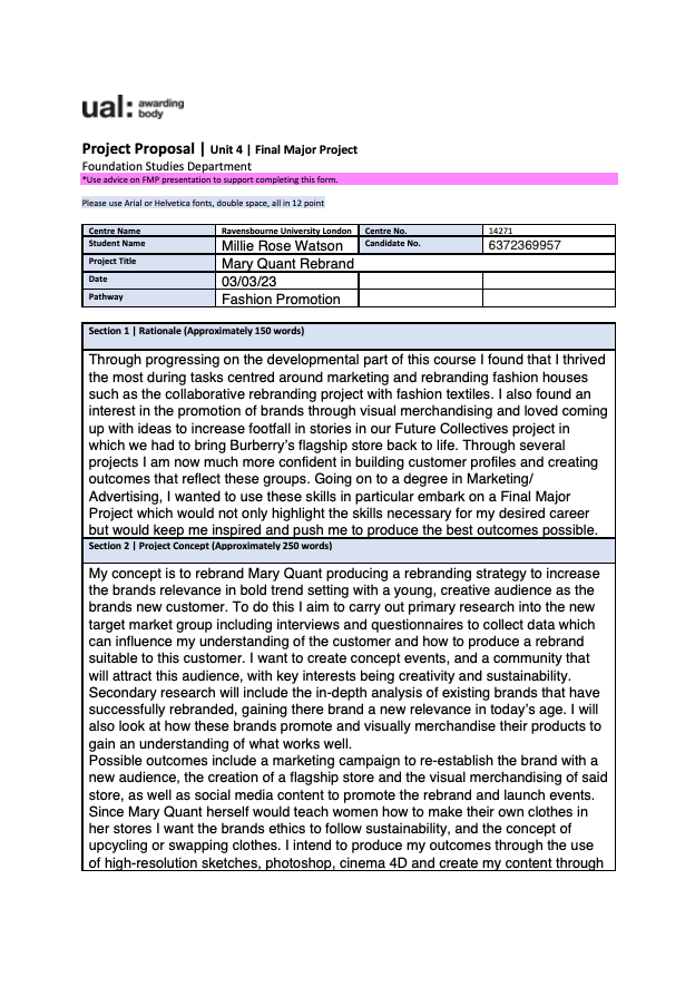
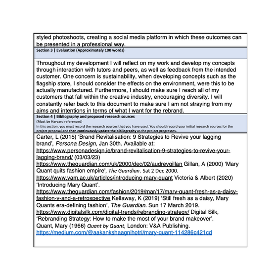
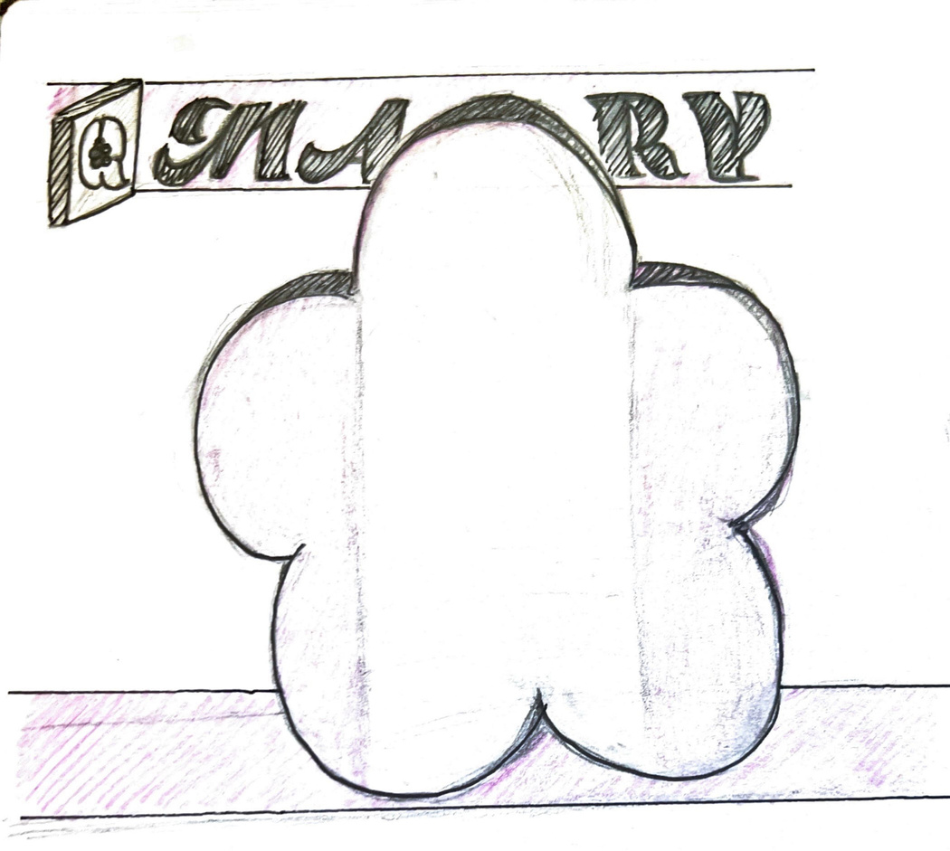
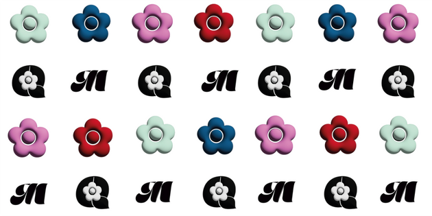
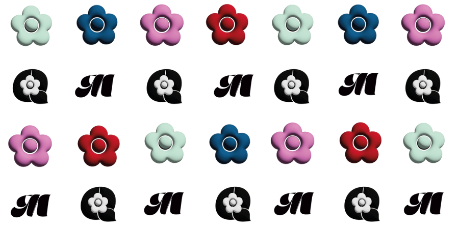
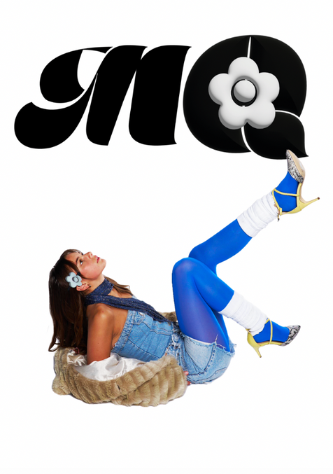
I also looked to make a new icon for the brand using the Q for Quant and the iconic daisy logo.
I used the typeface Marshmallow to be a primary font which Mary Quant will use when displaying the name, but I made some edits to this typeface. I changed some of the serifs to make the words more readable- and therefore putting my own twist on the typeface for the brand.
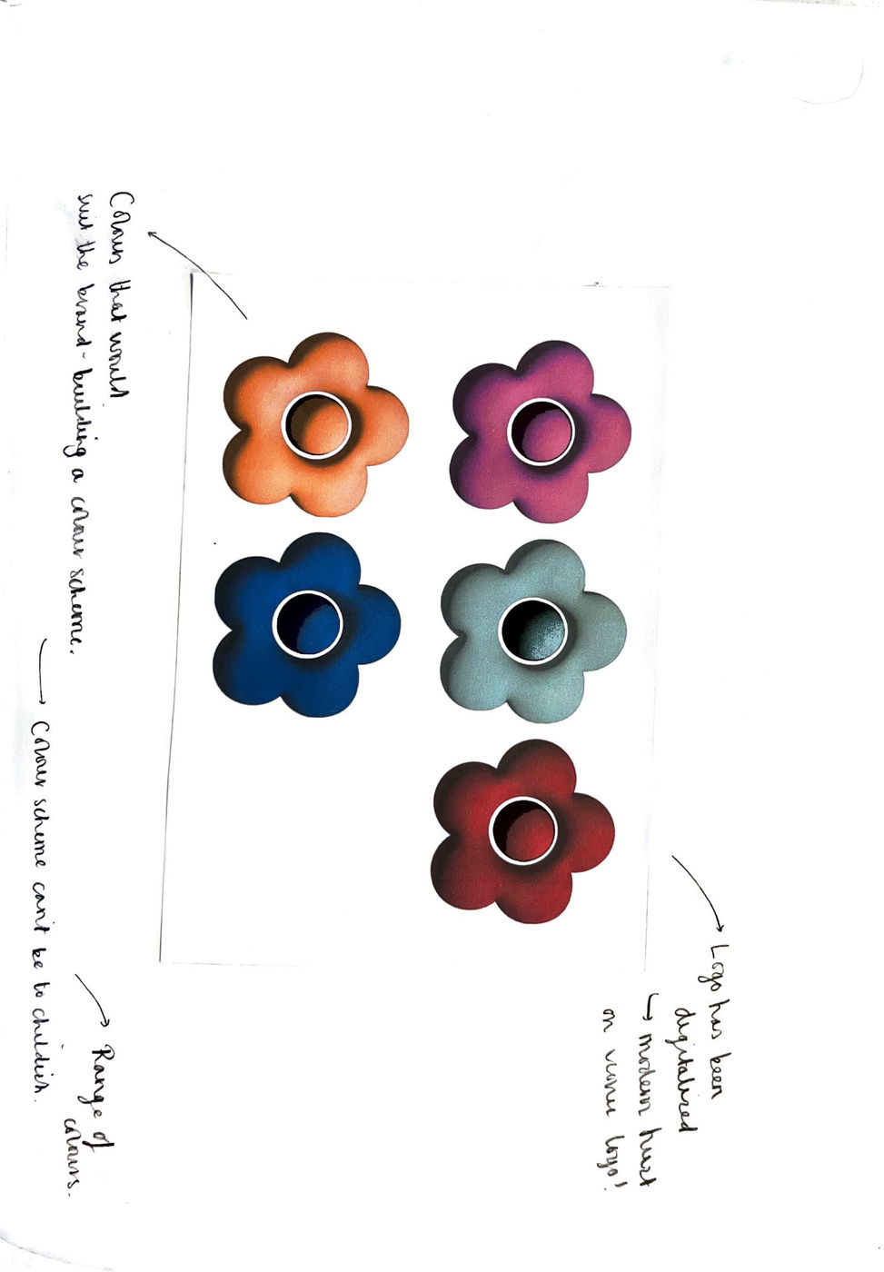
The first thing I did to the iconic daisy logo was make it appear more digital and therefore brought a freshness to the icon that before felt a bit flat and outdated. These 3D daisy's all in a colour scheme that reflects the floral boldness of the brand as well as the up and coming colours of S/S 24, have a big potential when it comes to social media and online content, the also have the potential to look great printed big as well.
mission statement
Problem Solving | Development
The Mary Quant Rebrand aims to gain Mary Quant a new relevance within a younger audience as well as building a creative community which can empower women.
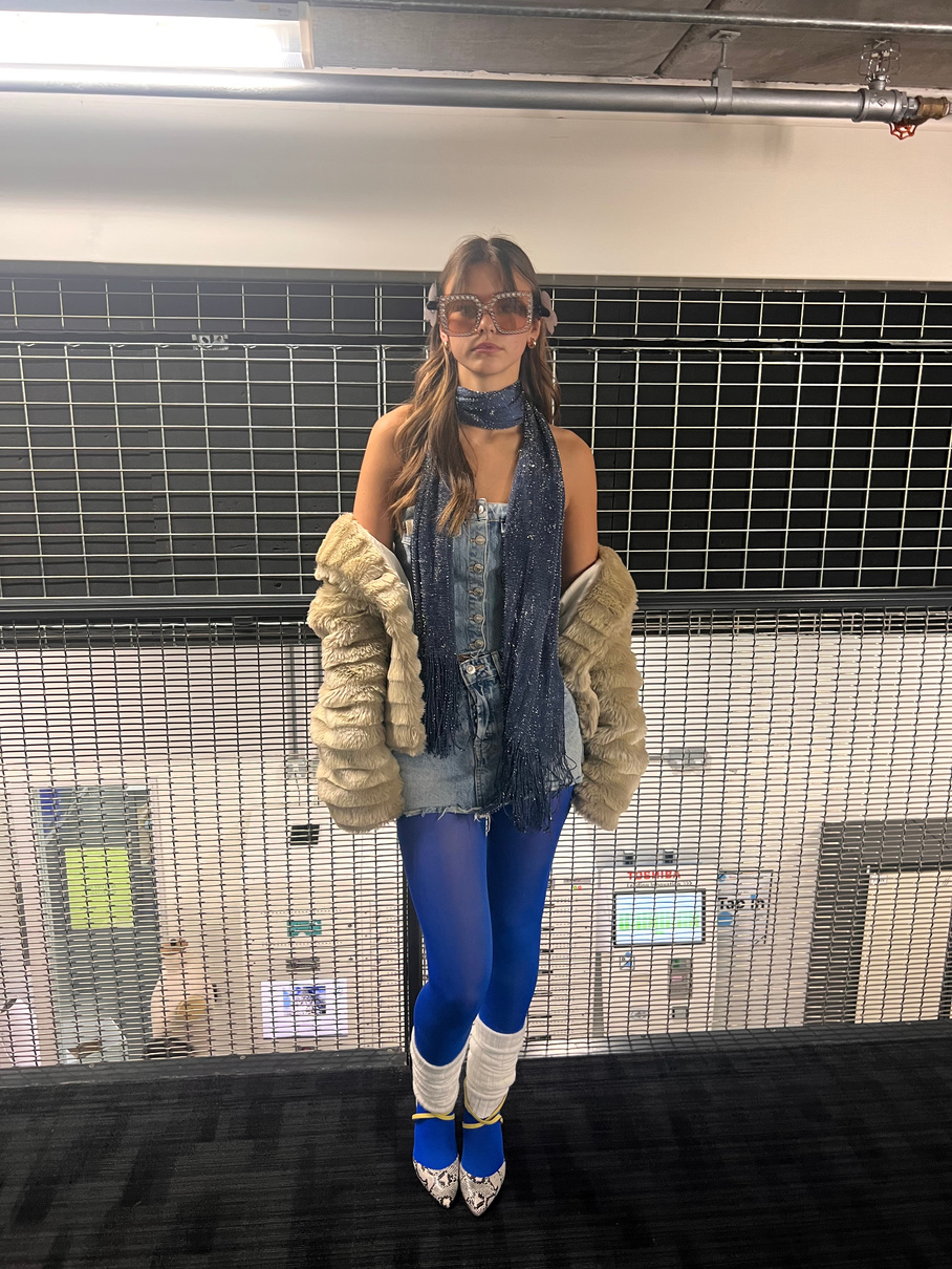
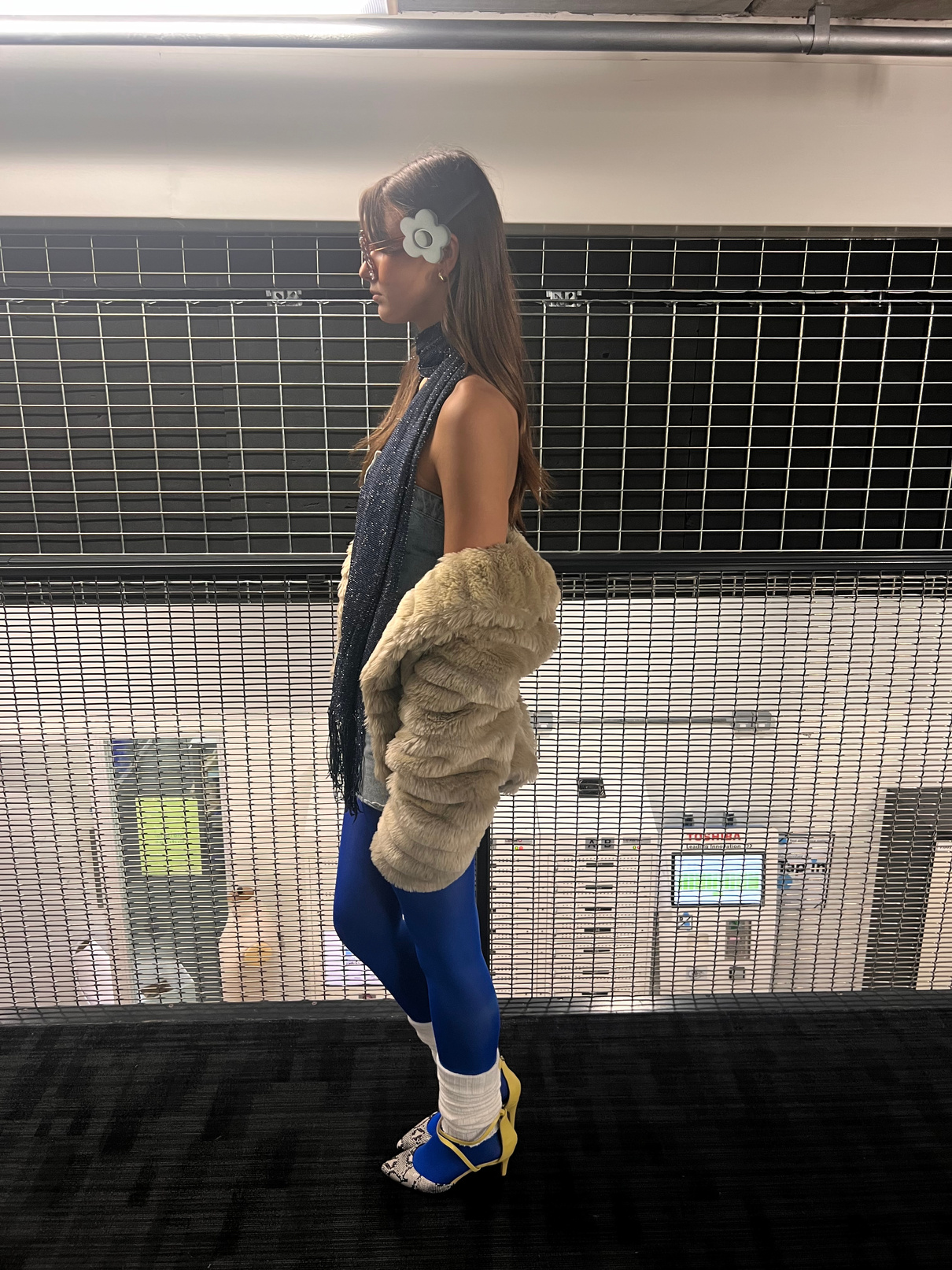
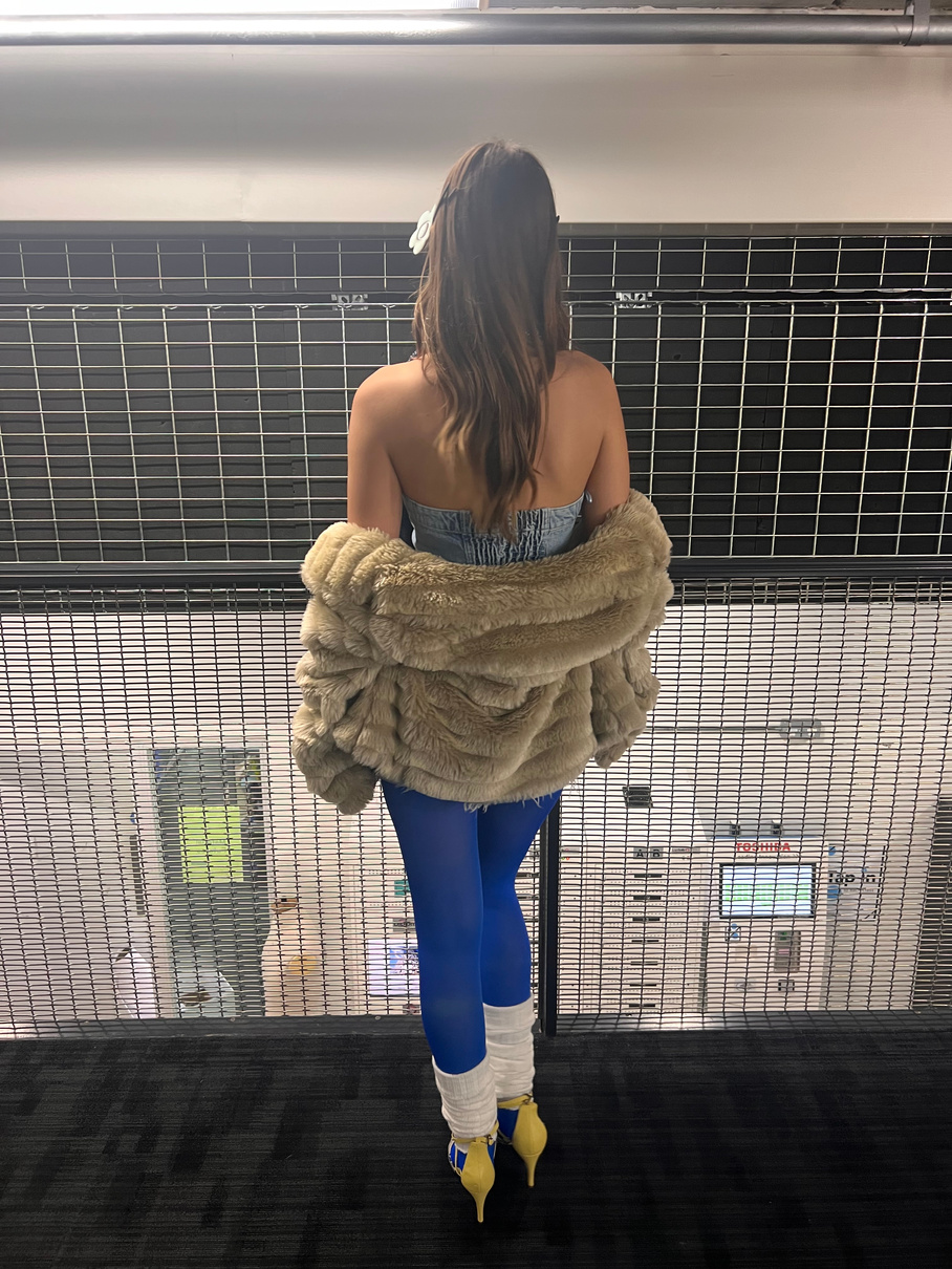
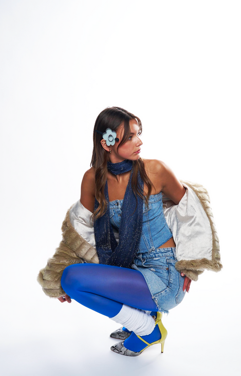
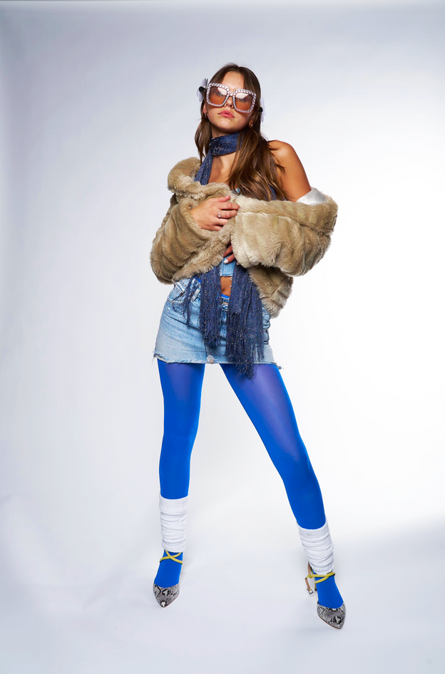
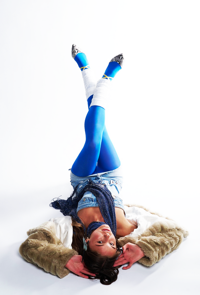
Test Shoot 1
| Testing hair and makeup
The aim of this shoot was to test out posing as well as hair and makeup to get started at trying to provide a fun and retro vibe that doesn't look costume like. I created this look by referencing my makeup and hair board and was happy with the outcome. However, I need to work on the styling of the model as a whole to really reflect my customer and the brand, at the moment the outfits are not working well and did not bring much to the shoot, hence why the outfits were not photographed.
In particular I thought the mirror image worked well because it added an extra layer to the photography and there is the opportunity to play with the mirror when adding graphics.
The poses of the portraits were based off of photography of women in the Mod era of the 60s.
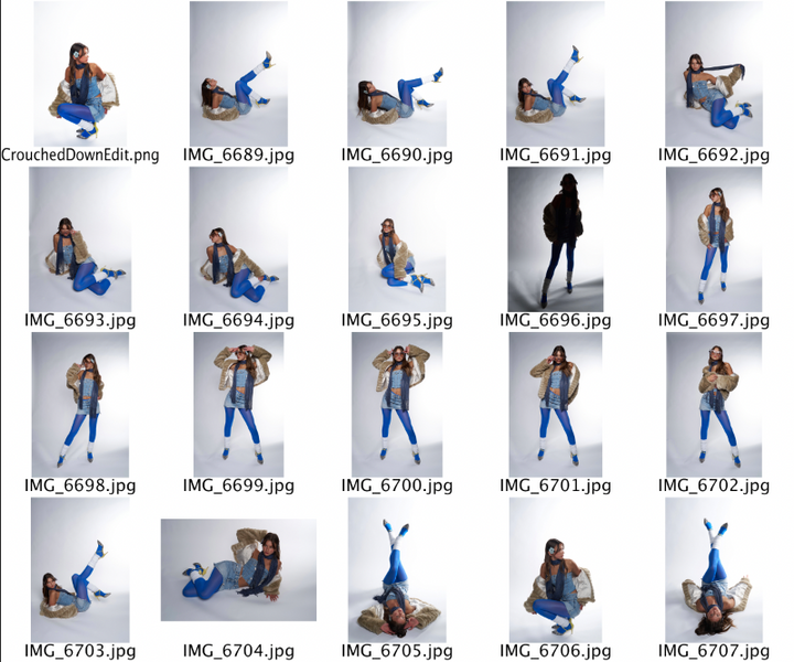
Test Shoot 1
Reflection
How to improve from this shoot
- come up with concepts for photoshoots which are less obvious.
- test out more expressive posing and get full body shots rather than just portraits
- Try using more than one model at once
- Photograph women more naturally, to reflect the community aspect of the rebrand, photographing women work together rather than posed.
- Look at actual Mary Quant campaigns that were taken on locations rather than on sets.
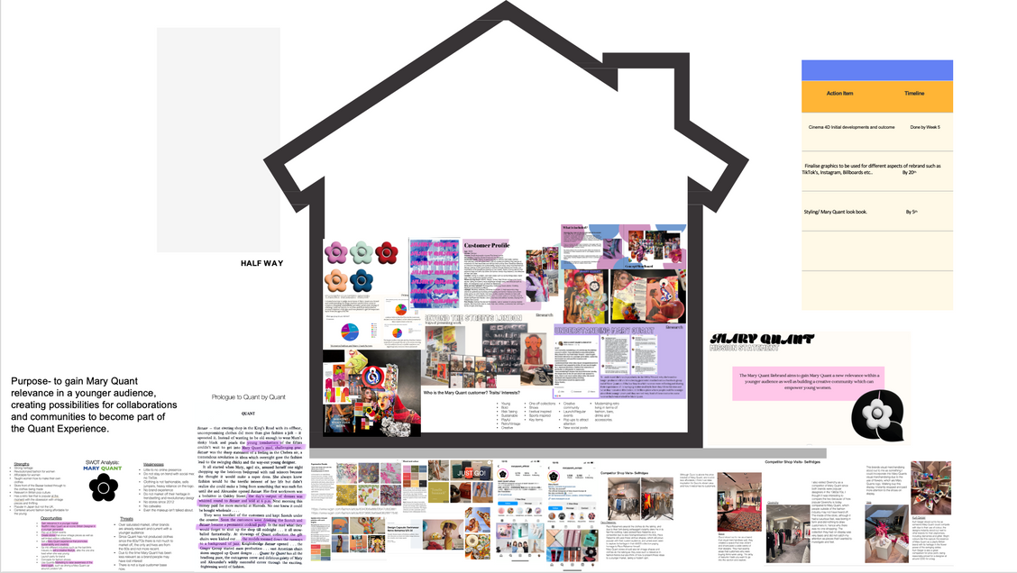
Mid-Point Reflection
Reflection | Planning
Creating a house out of the work I have done so far within the project helped me to understand what I need more off to push the rebrand forward, I understand that I need to develop my styling in terms of shoots and start developing initial ideas for my flagship store, the visual merchandising for the store and how it will look inside, I plan make the final design on Cinema4D. I also need to generate ideas around social media posts, in particular I want to look at building a filter to promote the rebrand. I want the social media to be a mix of photography and graphics/ animated graphics.
Developing a store
Planning
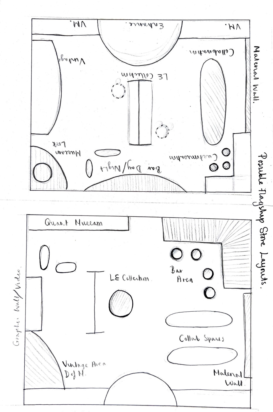
Making a floor plan helped to think and plan what sections should go into the store and where these would be. I knew I always wanted an area for collaboration and a space in which old Mary Quant outfits could be displayed. I also thought of having a section in the store in which a new young female designer could promote their work and sell their designs, to help their brand reach a wider audience, the space would also include a day/night time bar, as having fun and partying was a big part of Mary's experience running the company and is one reason the brand made people feel like a collective.
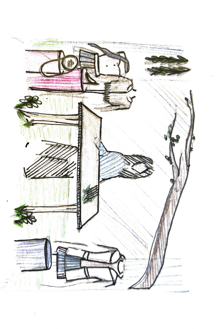

Here are some initial sketches of possible visual merchandising for the flagship store, in particular I like the idea of having a florist in the window working and creating bouquets, this is because it will attract attention through interactivity and bring another layer to the design. I also like the idea of having a statement door as shown to the left since this will stand out on a regular high-street.
Practical Skill
Planning for easter
Planning and Production
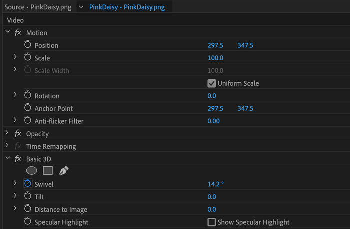
I think the animation is successful is displaying the new digitalised logo in a fun way that can engage audience, but also work well on a social platform.The animation has a transparent background and therefore can be placed in front of other posters or videos in the background, which could be a fun way to gain awareness of the brand through instagram stories or online advertisements.
Moving forward I would like to experiment with place this moving animation over brand imagery and photoshoots to see how to adds to the images.
I think the animation also shnows off the colour scheme well. I am happy I made an animation because it shows a different media that can be used to promote the brand and adds to the holistic rebranding, also since I am not used to animating it was a new skill that I learnt and I can take forward in other work.
If I was to do the animation again I would probably make it spin faster and maybe add in a flower with a pattern, or perhaps project old archive images on to the flower as a hint to the brand returning.
Reflection
(for longer animation look at the link)
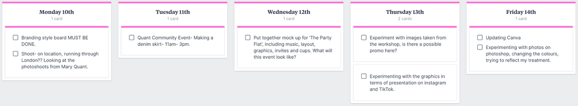
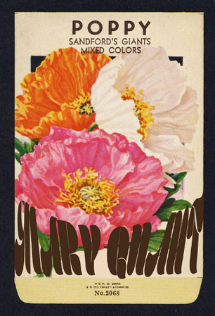
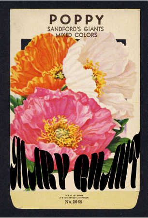
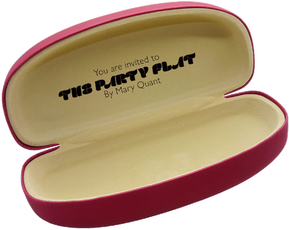
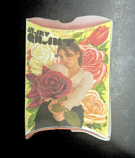
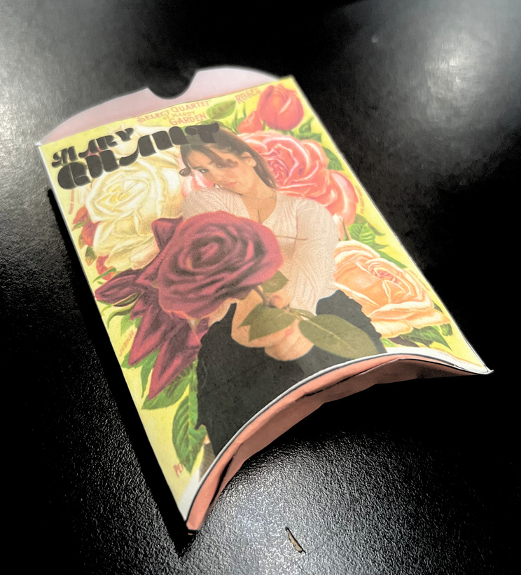
Developing invitations for launch event 'the party flat'
Practical Skill | Development
Concept 1- Mary Quant Seeds as an invitation, something fun to encourage them to grow their own plants whilst inviting them to 'The Party Flat'. The seed packet would be in a vintage style and link in with the brands logo, the Mary Quant logo.
I created the curved font by using the Envelope distort- make with top object.
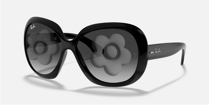
Concept 2- Mary Quant sunglasses as an invitation, open the sunglasses and the invitation is written on the top of the case. The M Q is shaded in the glass to create a unqiue link to the brand, that the recipiants will want to keep. I think this idea suits the launch event slightly better due to the link between parties and sunglasses, however, the seed idea is unique and helps to support the sustainability aspect of the rebrand.
research into sucessful rebrands- what did they do well?
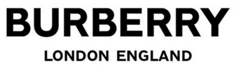
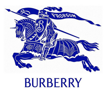
I looked to Burberry as an example of a brand who has both recieved critisim around a rebrand but also, more recently have successful revived the brand to make it stand out in the market and move away from being unrecognisable in the world of designer fashion.
Ricardo Tisci brought streetwear to the brand which brought a new Helvetica typeface logo, that brought a new era for Burberry, but also controversy surrounding whether the logo really reflected the brand.
The newest rebrand saw Daniel Lee take Burberry back to its British roots, bringing the logo back to a previous design.
“Burberry flies the flag for Britishness and for the UK and for culture. So, we have to use our platforms because we have a responsibility to communicate those things,” - Daniel Lee
Taking from this rebranding, I want to be able to honour the origin of Mary Quant and do the brand justice, with its major relevance in the 60s/70s.
Whilst making the brand relevant for a younger, GenZ audience, I want to make sure the original playfulness and ability to empower is not takne away from the brand, that is why when developing the visual communication of the brand I wanted to make sure to honour the previous logo, just revamping these to make them more eye catching to a new age and new audience.
Reference website ; https://www.gq-magazine.co.uk/fashion/article/new-burberry-daniel-lee-2023
Research
Graphic Style board
Practical Skill
Here the surroundings of the mannequin stood out to me, not just the styling of the clothes.
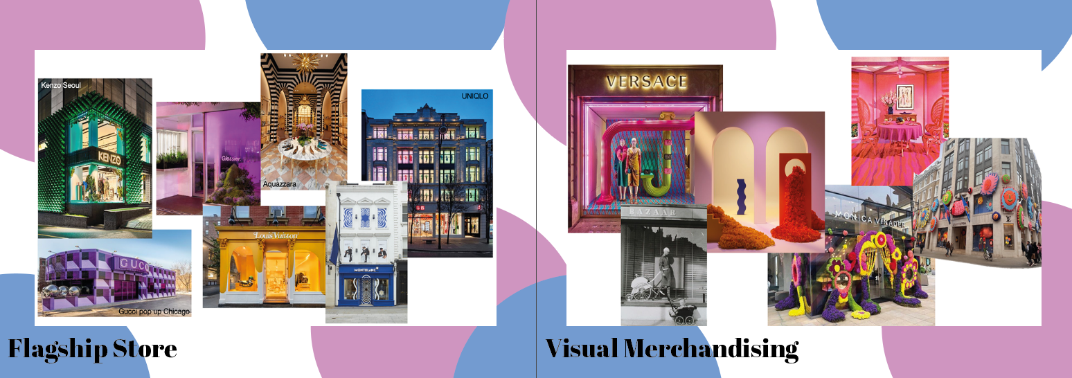
Visual merchandising- what does the customer want?
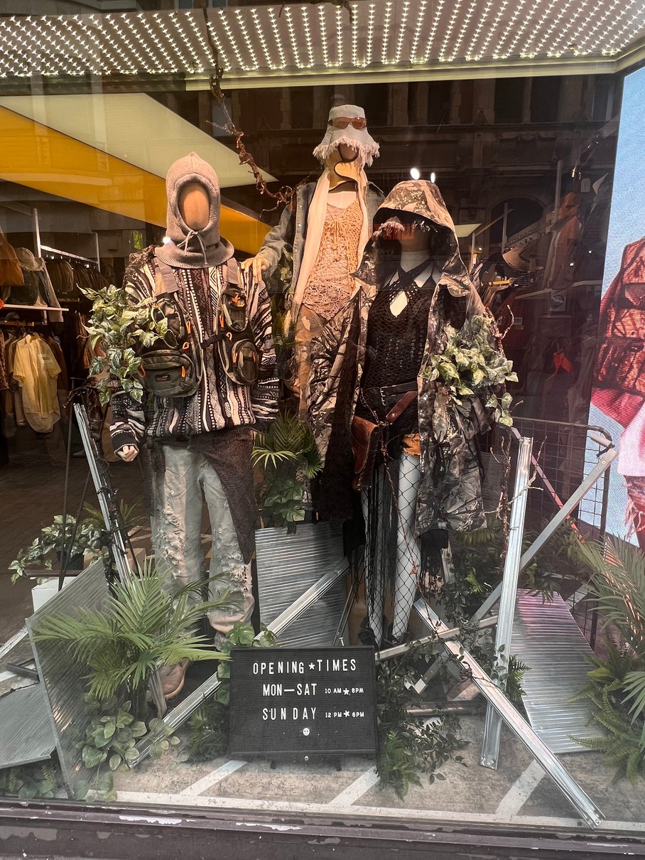
Shops such as BeyondRetro focused on styling mannequins to a specific theme.
I visited central London, around areas such as Carnaby Street to look at visual merchandising trends and what is bringing people into the stores. I got some information from my Target Market Group, women aged 18-25, to see what brings them into stores through an online survey.
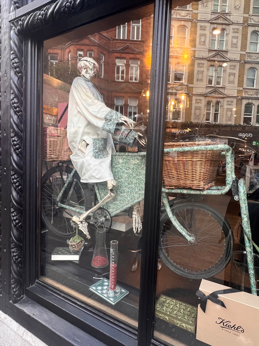
Many of the shops that I past such as this Kiehls display had eye catching elements that would spark humour in an audience.
Problem Solving | Research
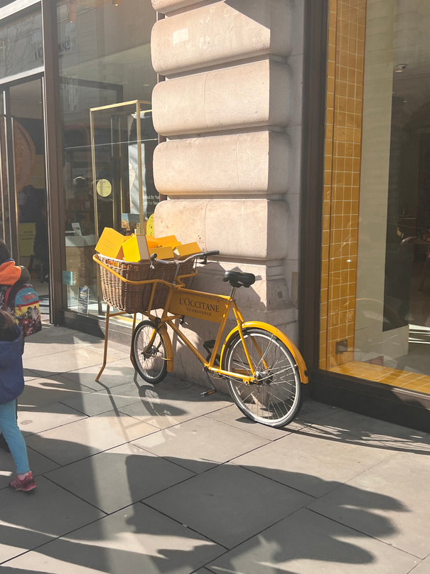
Shops such as L'occtaine had visual merchandising inside and outside of the shop, to engage customers that do not stop to look in the windows, but only pass. This a great way to attract attention because it strays away from containing displays in the window but branching out the street.
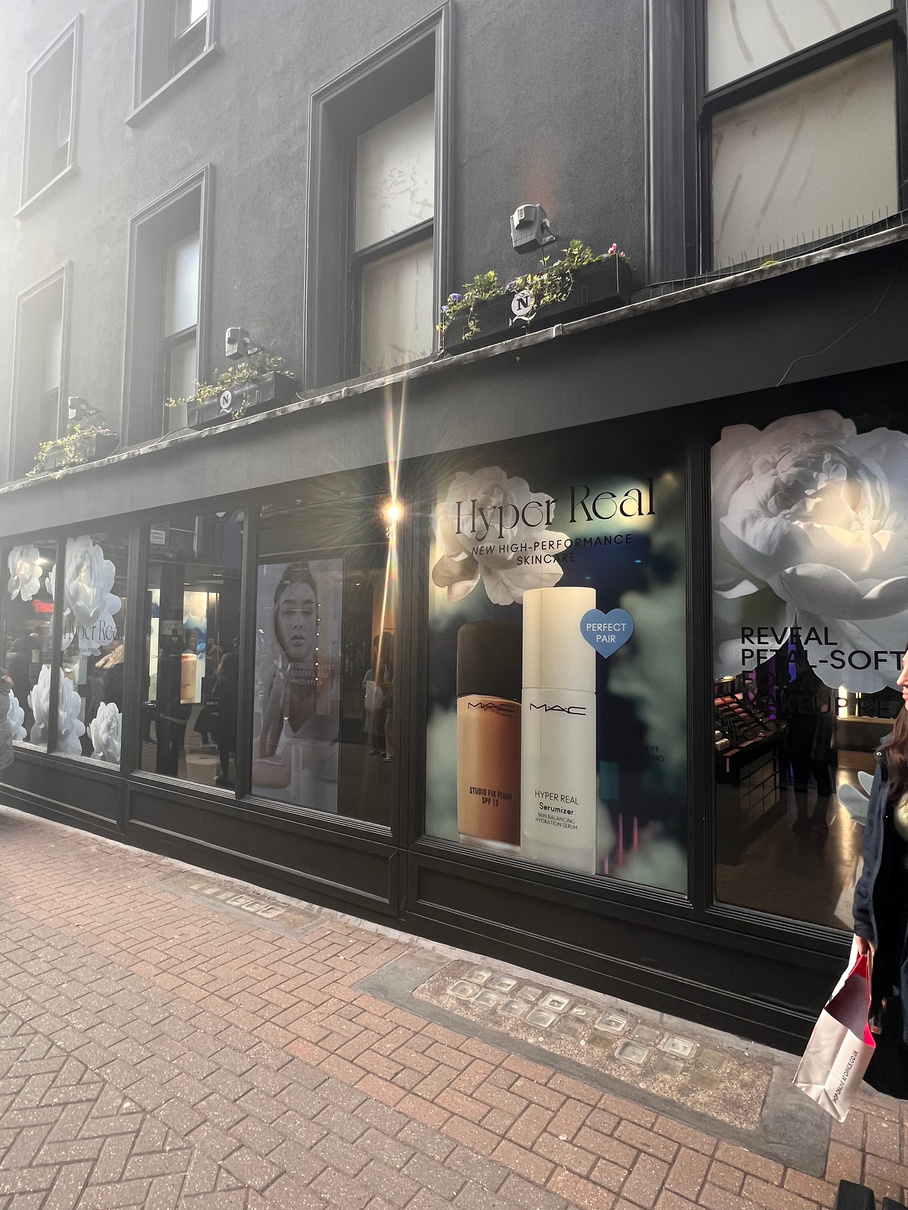
I found that graphics were a big part of the displays, here in the Mac window, the flower graphics take up the majority of the window, along with printed graphics of new products, and these products being worn on a graphic display. The graphics left some space for walkers by to ook into the shop window, the graphics reflected the current campaign well.
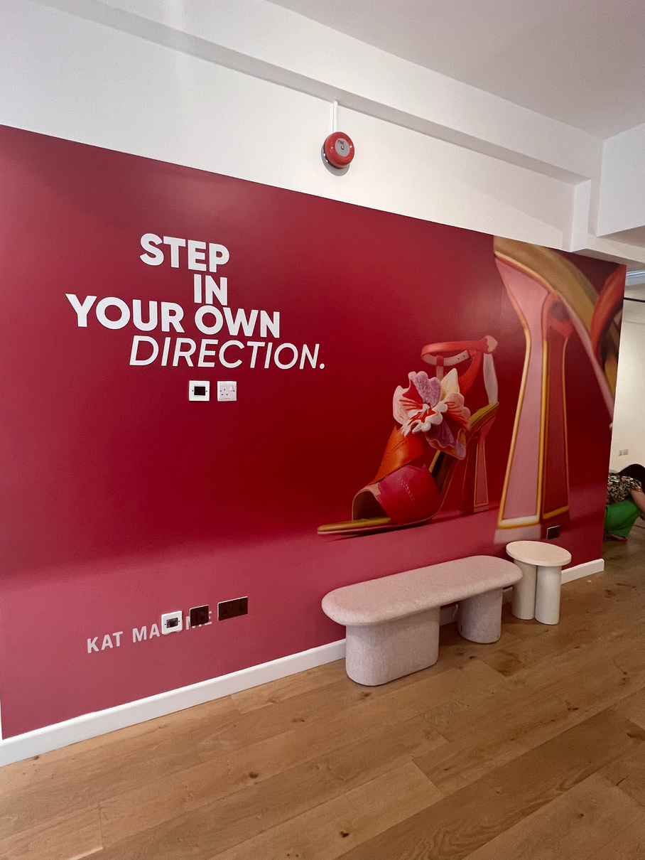
This wall graphic display in Kat Maconie caught my eye due to its size and bright colours. Something like this would work in a Mary Quant store, with the new graphics as stickers on the ceilings and walls, along with a feature wall of current campaigns within the store. I also want to make sure the shop is bright, reflecting the playfulness of the brand but also transporting the customer into a new world, with interiors reflecting the 70s/60s whilst screens and graphics bring a modern twist.
Problem Solving | Research
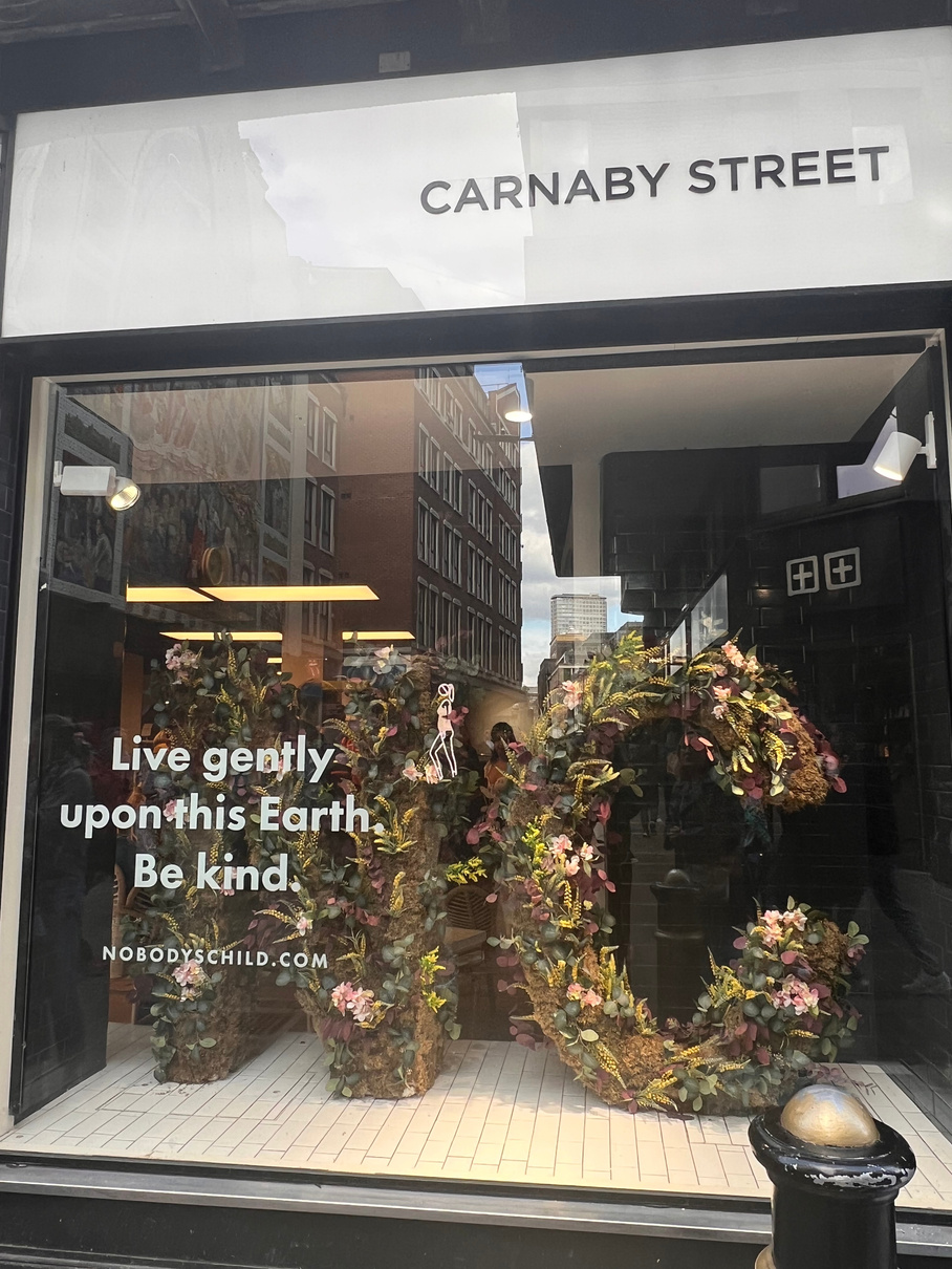
One trend I recognised in the stores was a connection nature as seen in the window of Nobody's Child. This is relevant to my brand and the designs for shop windows I have already considered because of the connection Mary Quant has to flowers.
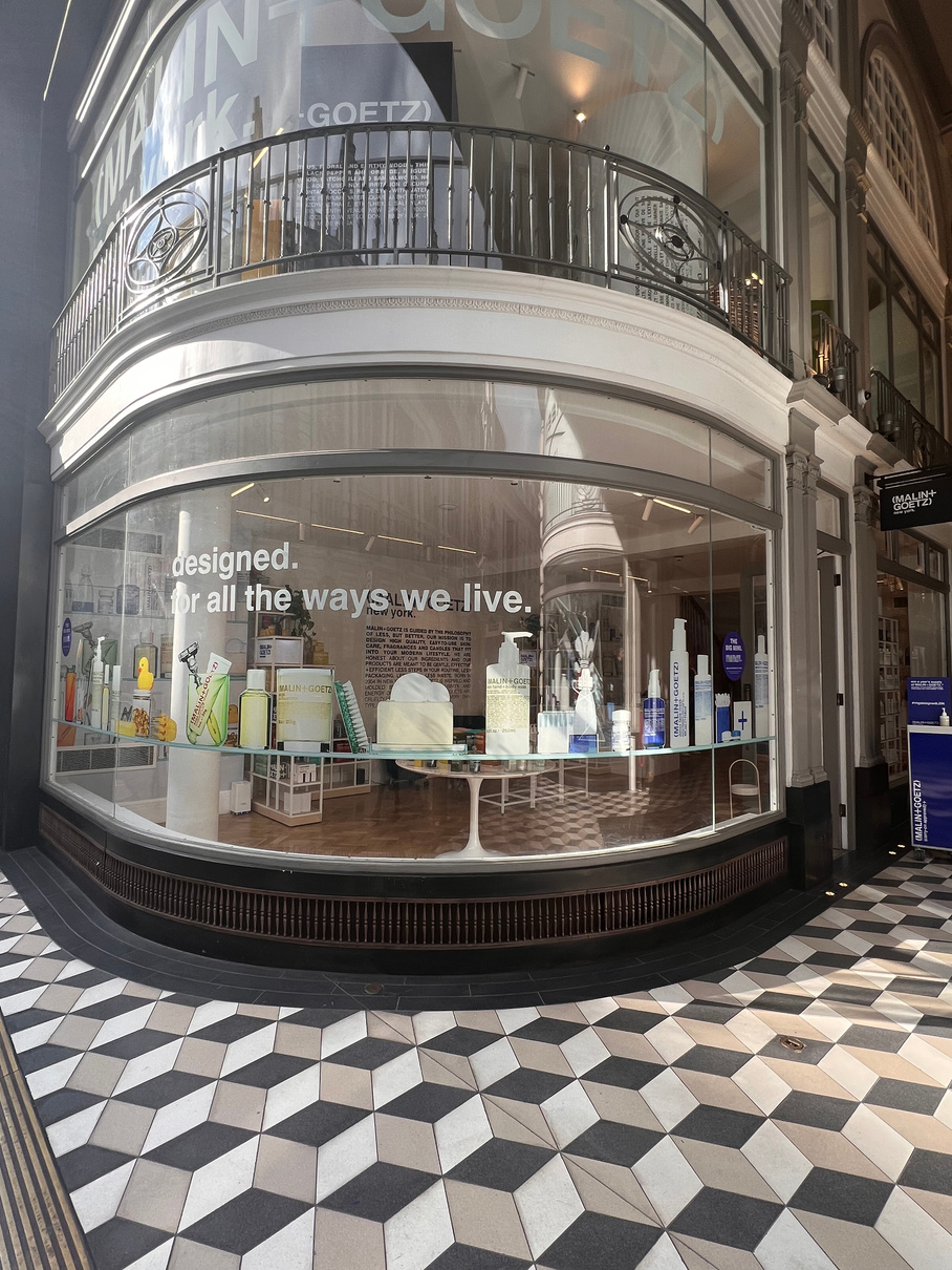
(MALIN+GOETZ) is another brand that uses window graphics well and in particular uses the curve of its shop to the advantage of displaying its products, that cannot be seen well through the window, by printing the products as graphics, the design is simple and affective.
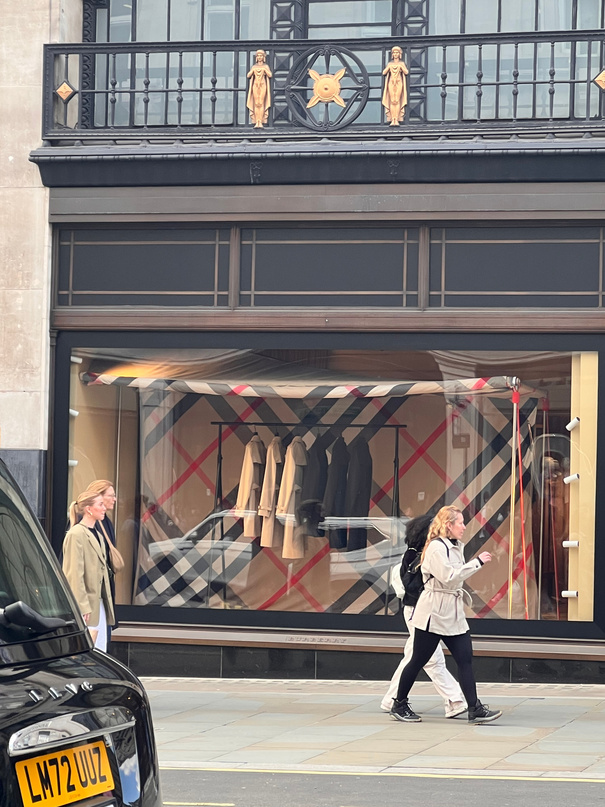
What Burberry does well is reflect a campaign all throughout it's stores, since celebrating its heritage in outwear and having a catwalk in a big tent, the windows also follow this outdoor, British appreciation theme, however to someone who does not know this the windows may appear boring and bland,
Problem Solving
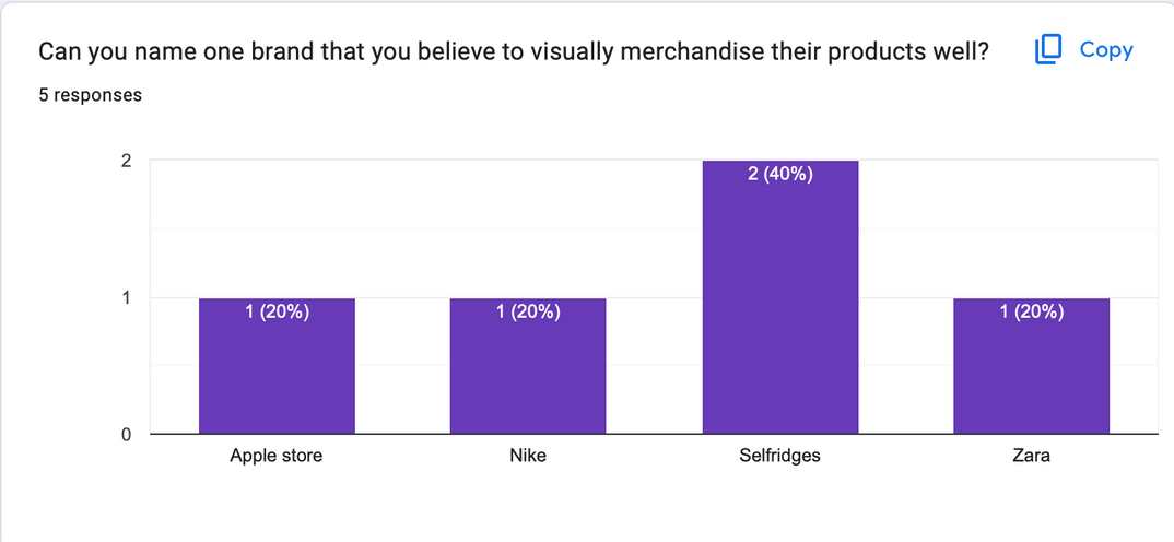
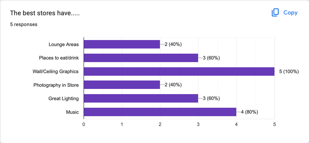
Flagship store survey responses
Research | Development
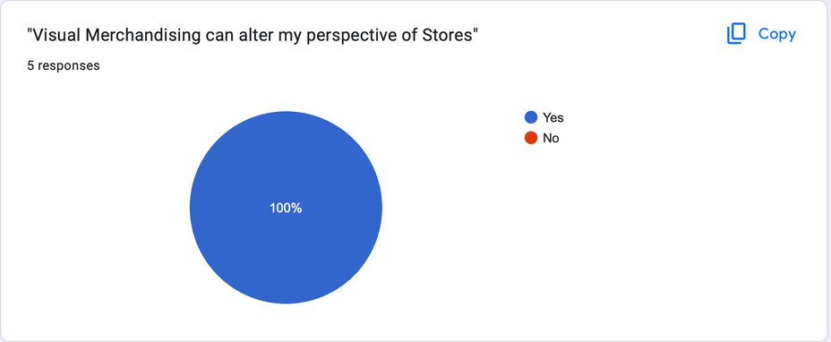
I created a survey specifically about stores and visual merchandising and got 5 people who are part of my TMG to answer the questions.
All answered that the visual merchandising of a store can alter their perspective on this store, which means that this is an important role in getting my customer to enter the new Mary Quant stores, and also making sure the purpose of the store is clear.
Selfridges was mentioned by two people when asking which brand comes to mind when you think of good visual merchandising, this may be because of the fun ways in which they market their products, with out of the box ideas. they also have displays of products within the store that feel immersive. They understand how to display products and clothing for a wide audience and what this should look like, the have a strong brand experience.
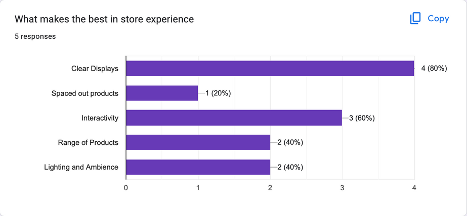
Clear displays were most commonly answered as being key to a successful in-store experience, also interactivity within the store was key, this could be in the form of testing the products in store, or other elements such as bar/restaurant areas, building a brand experience.
The answers of this question confirm what I wanted my store to include such as a lounge area, and a bar area, as well as music and wall/ceiling graphics which helps me to continue the development of the store and decide what these elements will look like and develop them on cinema 4D.
Mood board- Still life
Planning and Production
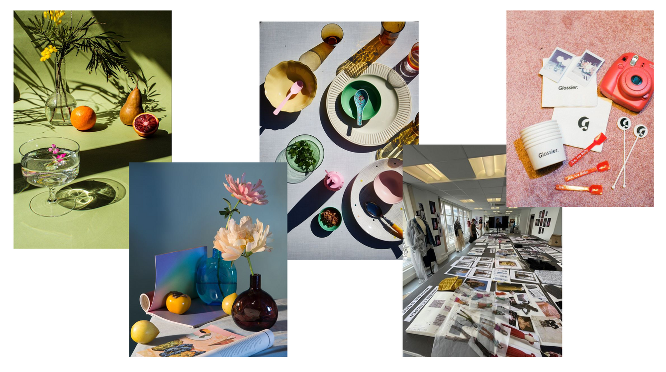
Practical Skill | Development
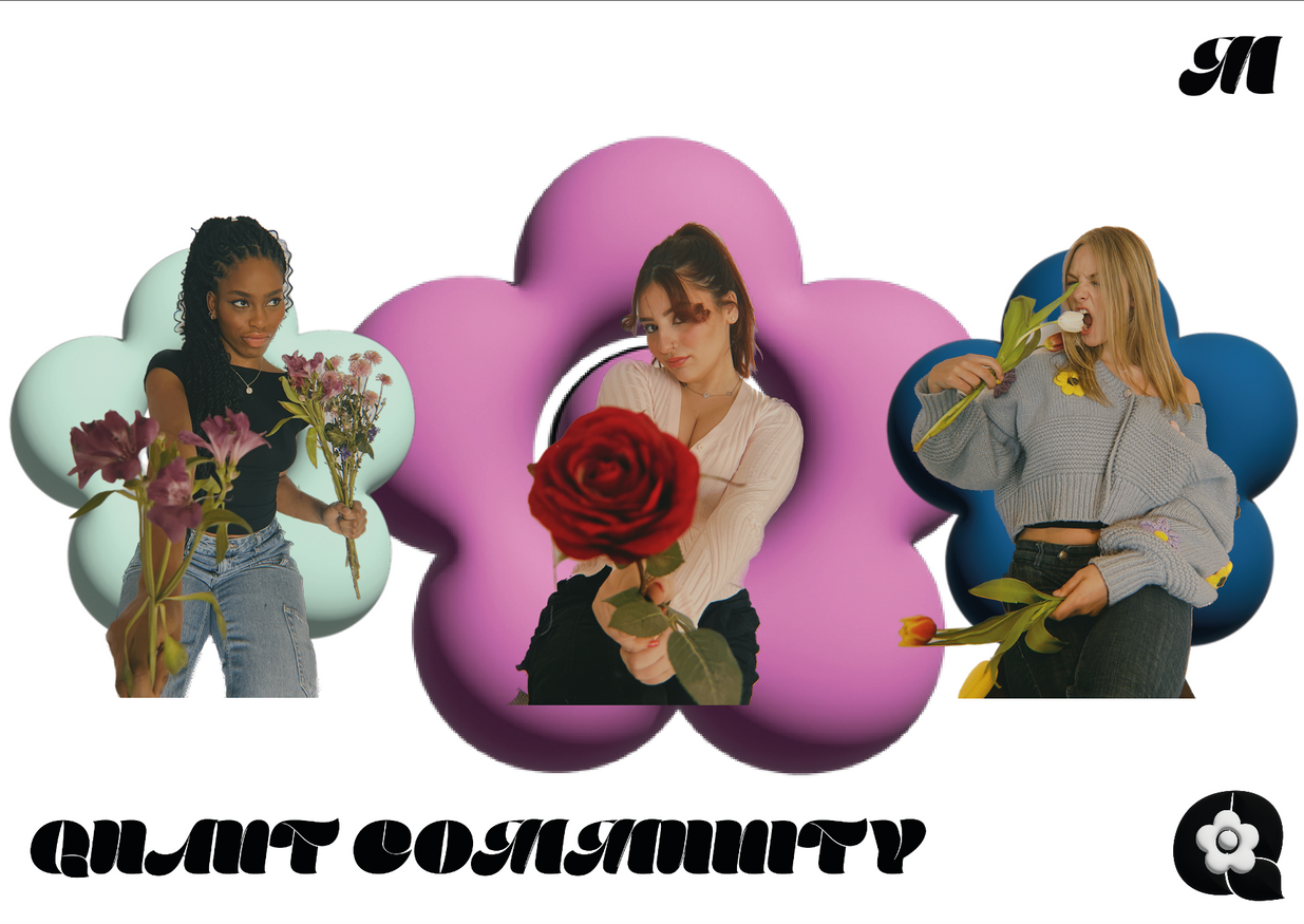
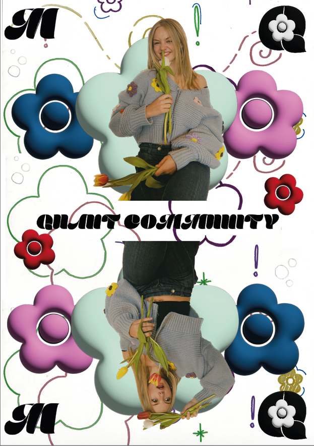
Still life - Quant Community
For this shoot I used some objects that would represent the creative community that I am trying to get across. I added flowers to bring across the fresh and fun vibe of the brand, and a cocktail which reflects the social side of the brand, in which young women can meet friends and other creative individuals.
In photoshop I adjusted the colours to increase the expsoure and the saturation to make the photo more vibrant. With these photos I went on to make some animations that would work well on Instagram.
Practical Skill | Development
Stop Motion - Quant Community
This is a stop motion video I made from the objects I had out to create the Instagram/Tiktok promos for the Quant Community, I wanted to use creative objects to emphasise the community that is going to be creative. I thought it would be a fun idea to create the shape of the flower logo to make sure the audience understands what brand the community belongs to.
I went to premiere pro to edit the exposure, colour and brightness of the video, to make it less dull, and fit the playful brand more.
Practical Skill | Development
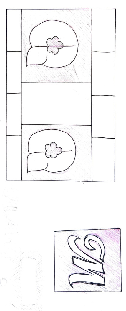
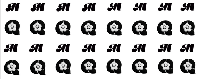
Making brand patterns
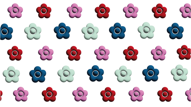
I developed these patterns as part of the Mary Quant brand identity, which can be used on branding, packaging and products after the rebrand of Mary Quant to help the brand become more recognisable.
I made three variations that using the new logos and icons I developed, in particular I think the plain daisy print works well along with the interchanging M and Qs.
Here is an example of how the brand patterns can be used in practice. To the right isa burger board that could be used to serve food at the brands launch party 'The Party Flat'.
Practical Skill | Development
Experimenting with instagram promotion
These are some experiments for how the Quant community could be advertised on instagram or on Tiktok.
I looked at three different ways of animating the tower and tagline, and what would work best as an advertisement.
Video used to animate on Canva; https://www.youtube.com/watch?v=hzO6TpiMB8U
Planning and Production
Reference list
Nintendo (n.d.). Campaign for Nintendo stating ‘What colour is yours?’
Unrecorded Faces (n.d.). Unrecorded Faces Campaign featuring Anouk .
www.etsy.com. (n.d.). 54 Old Vintage Flower Seed Packets Lone Star Seed Co. San - Etsy. [online] Available at: https://www.etsy.com/listing/712851487/54-old-vintage-flower-seed-packets-lone?epik=dj0yJnU9eVFoNjVwUF96UHQtU2xZMHlSM01ReHJmMlluSnVsSXYmcD0wJm49R0R4WDdMR0FvV255eEVod1U1eFp3QSZ0PUFBQUFBR1JSTmdn [Accessed 2 May 2023].
Practical skill | Development
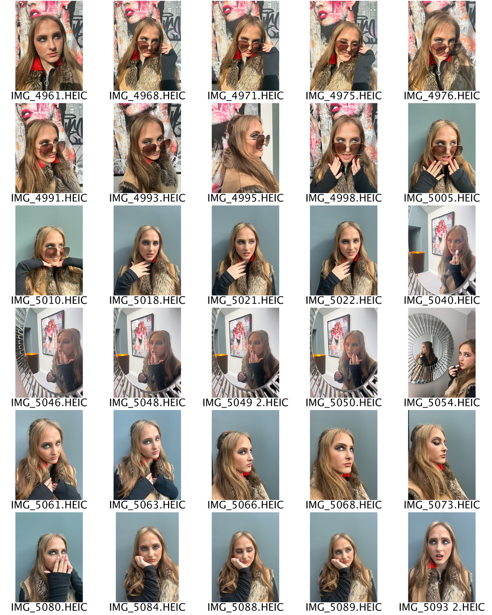
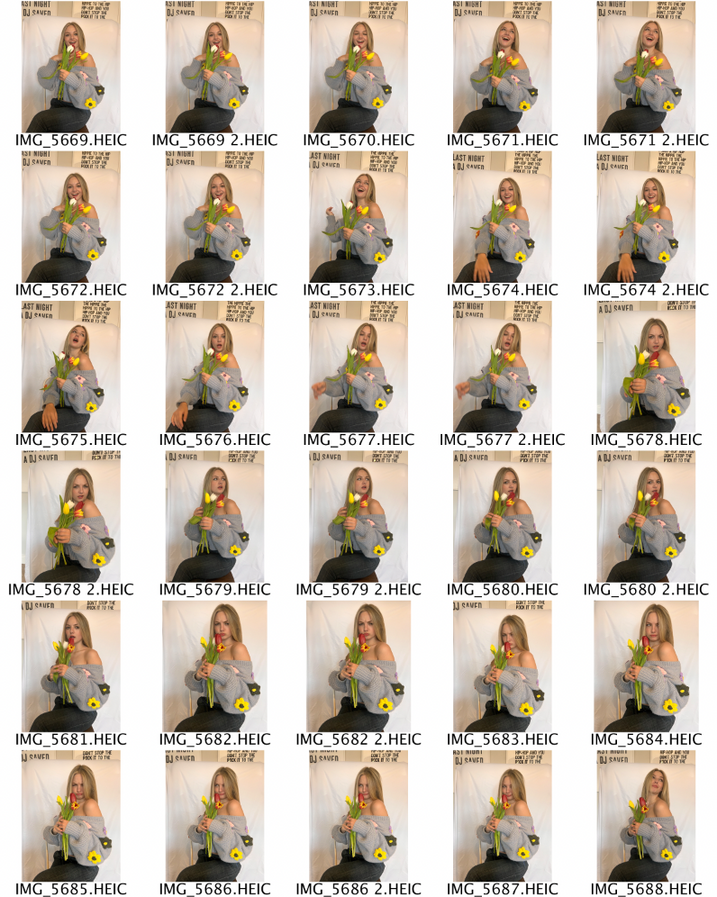
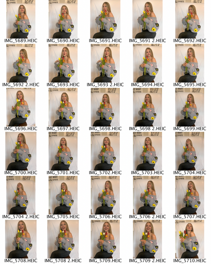
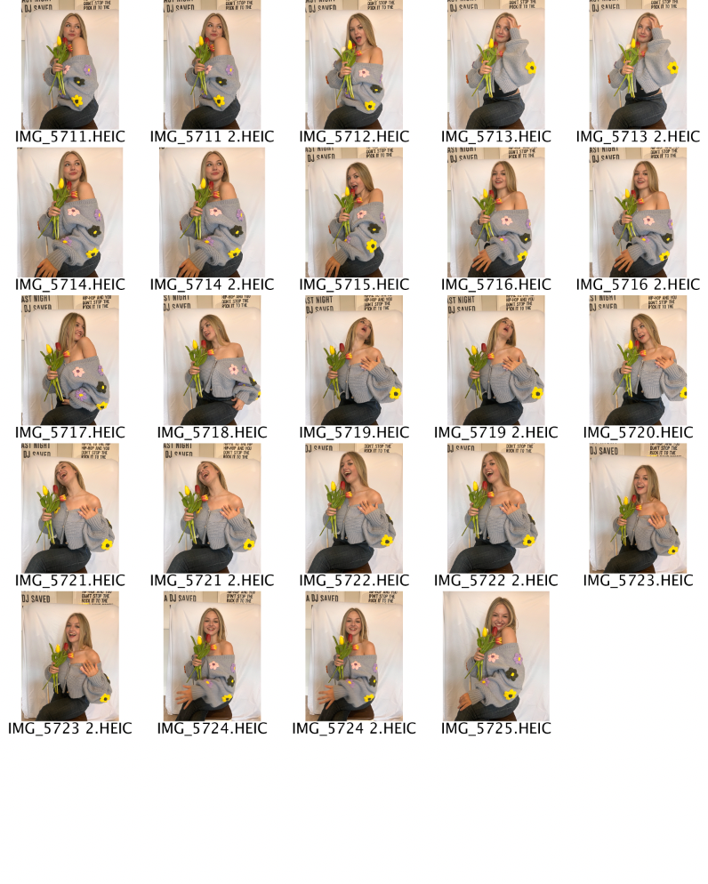
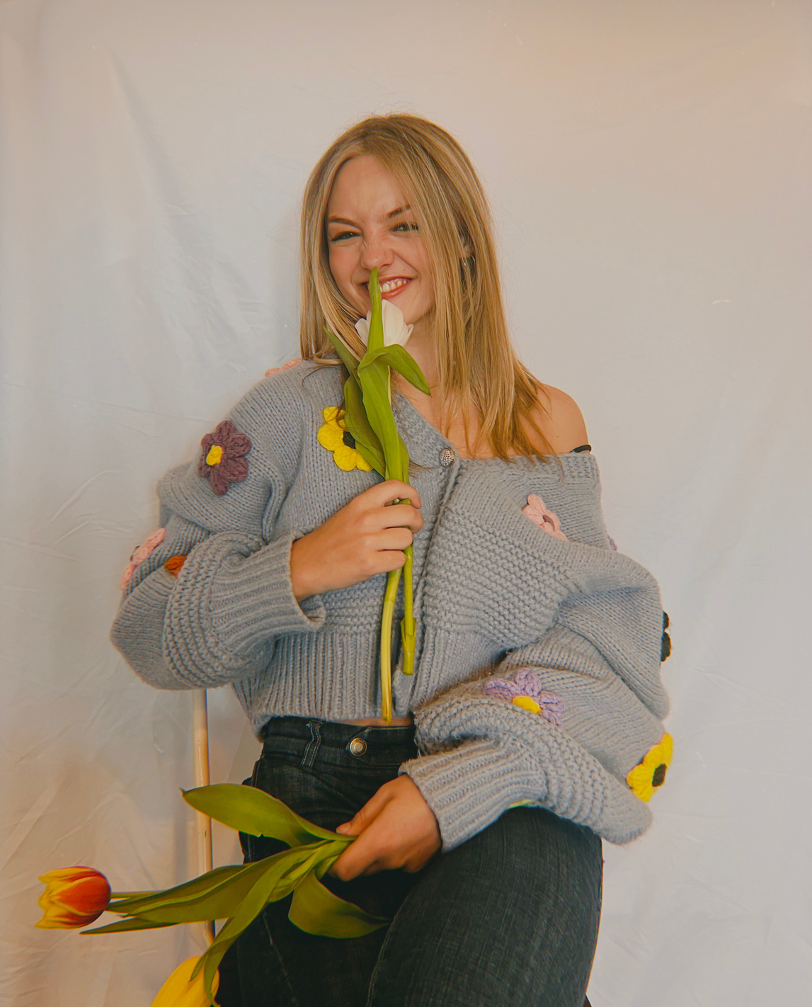
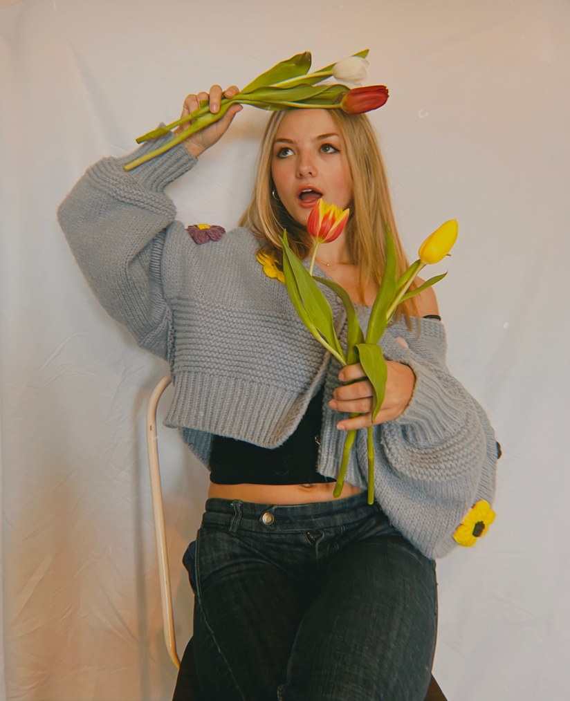
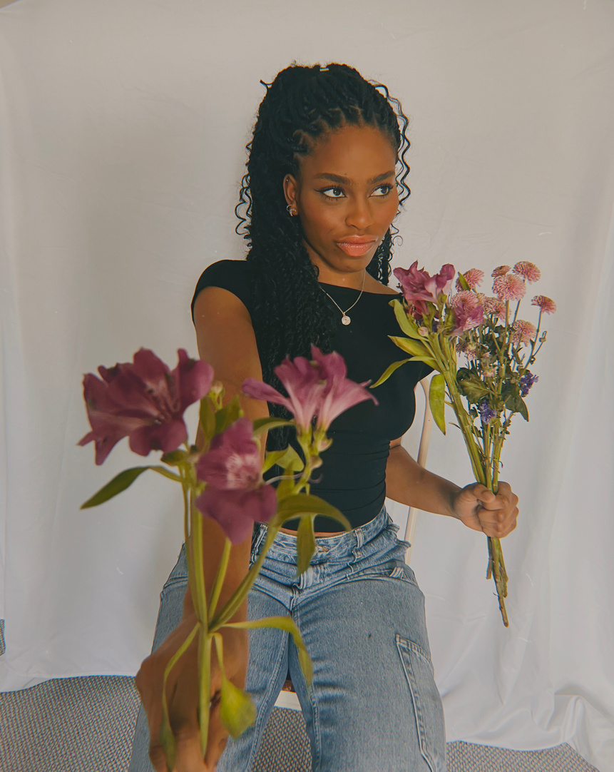
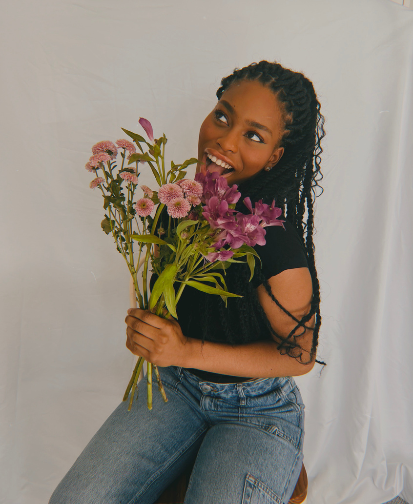
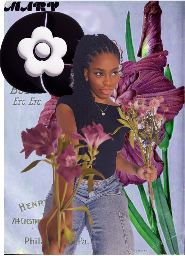
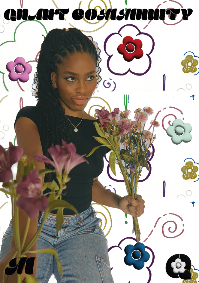
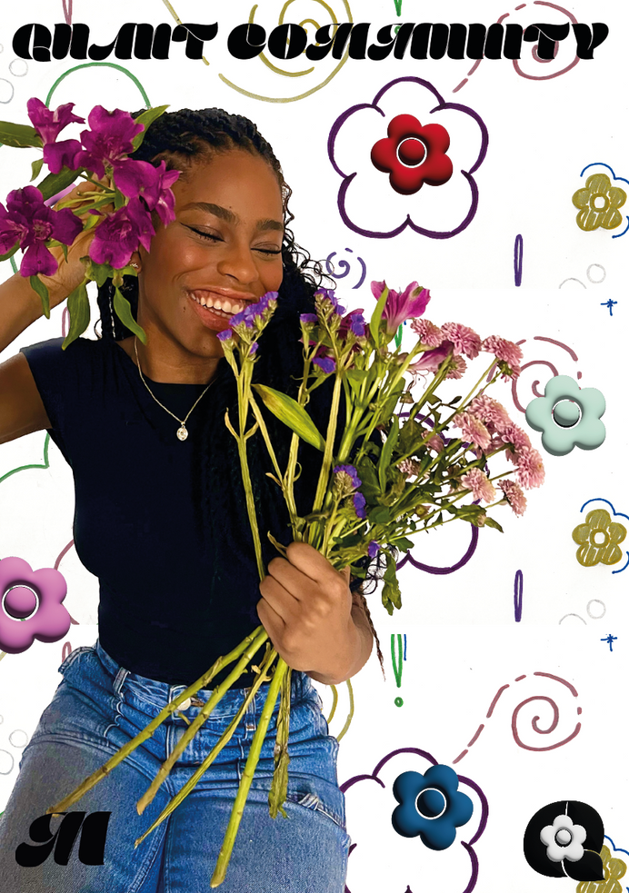
Here is the contact sheet for my first shoot for the Quant Community campaign.
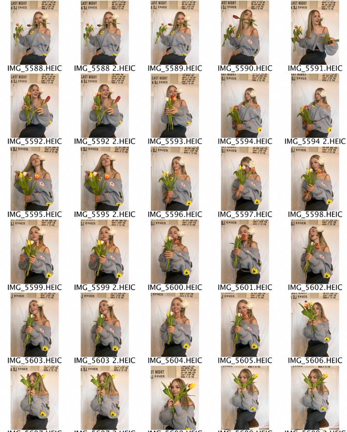
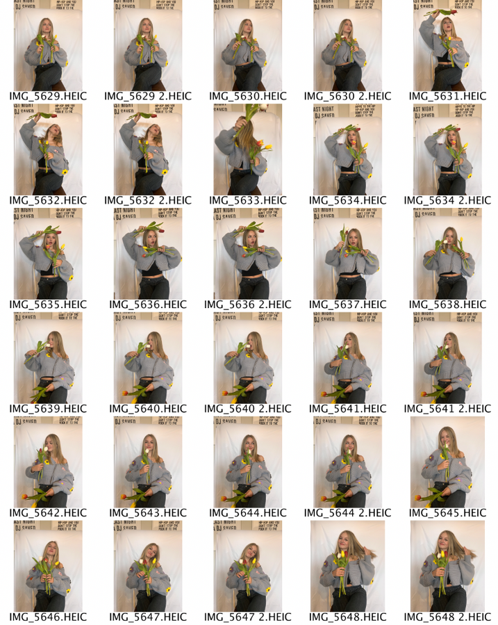
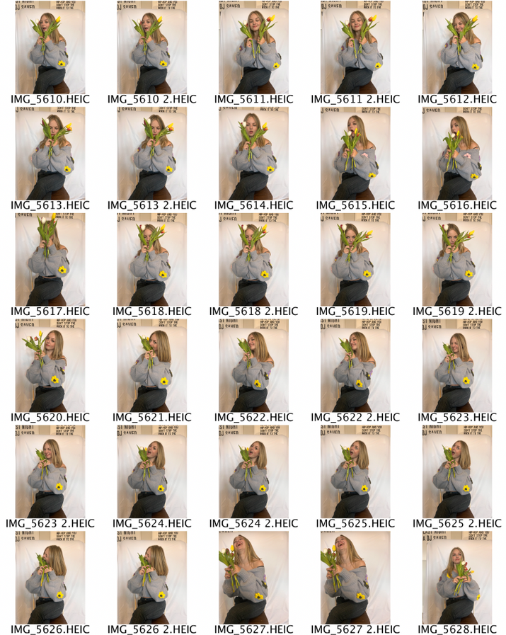
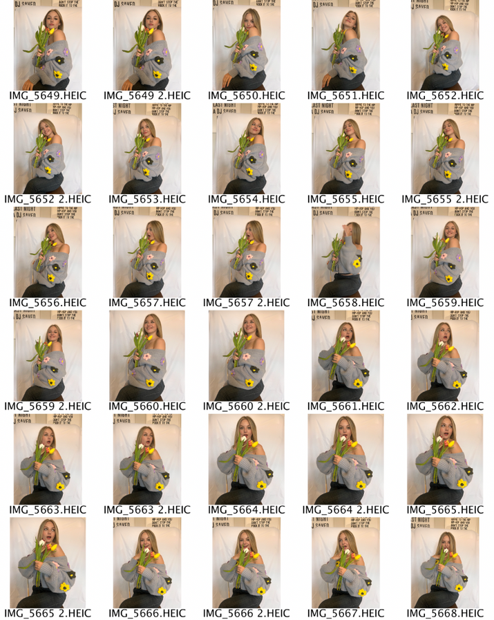
If I was to reshoot this I would perhaps photograph full body with a wider photography sheet to be able to allow the models to move around more and try different poses that didn't work out in this shoot due to the confined background.
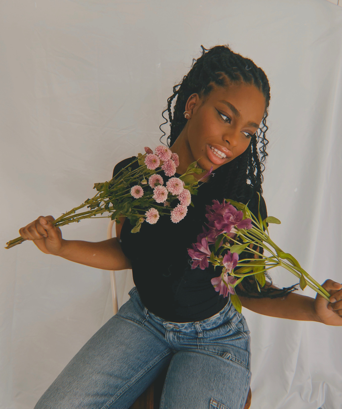
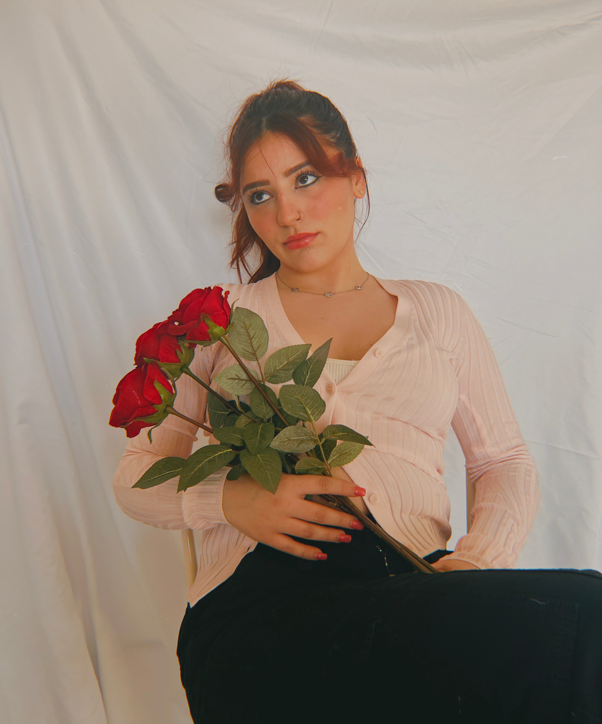
For this shoot I have three seperate sets of photographs, in the same collection. I had three models sit down on a chair in front of a photography sheet to mimic a school year book style photo, all holding different flowers and representing the different kind of personalities that will enter and use the Mary Quant store and join the Quant Community.
I sat the models down and told them to be expressive with poses and gave them the free rein with what they did to show their personalities which took a while to get the shots so they could get really comfortable in front of the camera.
I picked a couple photos from each model to edit on prequel and do further experiments with as seen below.
Reflection
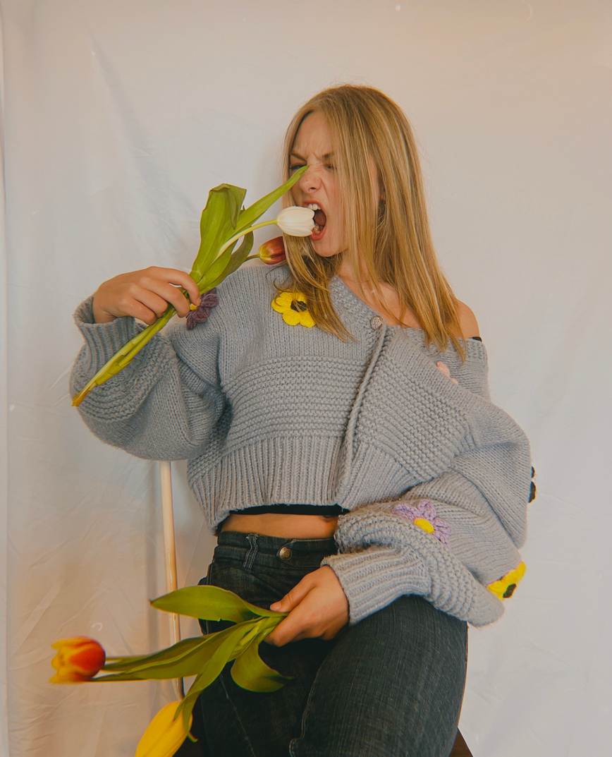
Using Prequel to edit:
Effect- Dust 1- 30
Filter- Palmero 1- 50
Exposure- -50
Brightness- 8
Contrast- 25
Shadow- -10
Development
Development


Development
Development
Development | Reflection
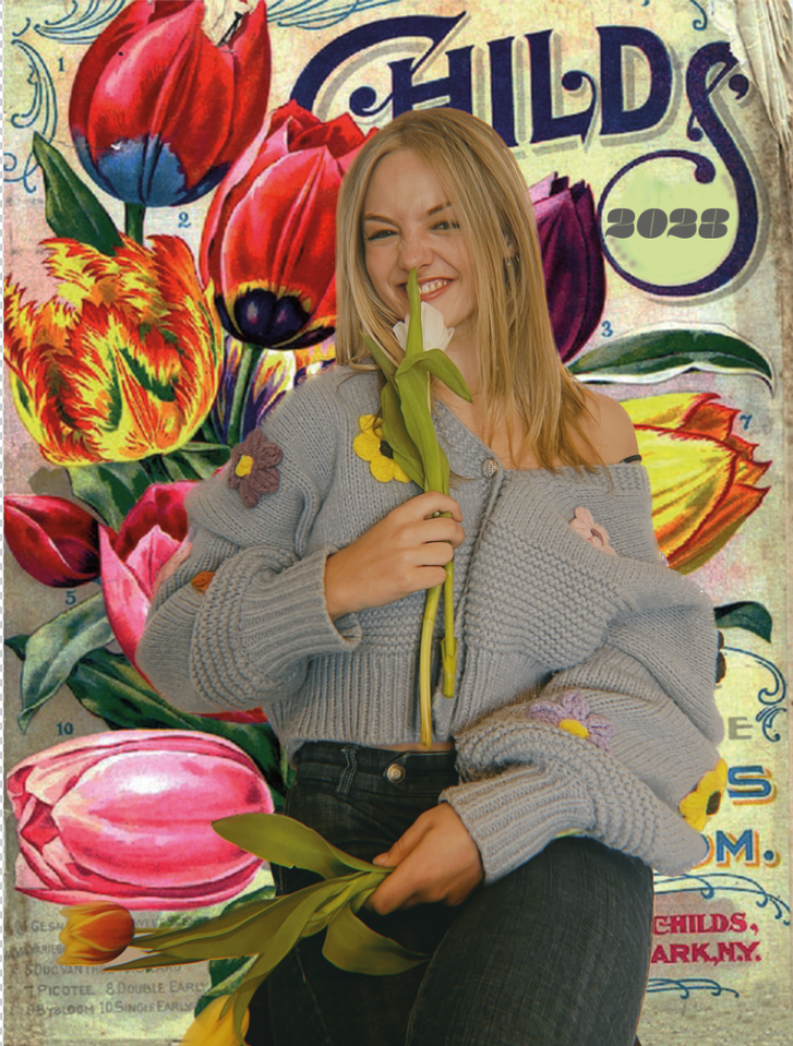
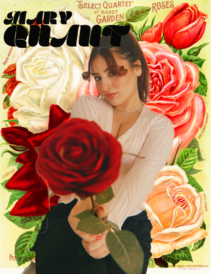
I edited my photos onto vintage seed packets that reflect the different flowers that they are holding, I think this is a good hint at the past of the brand and the modern day love for vintage clothing, products and objects, especially within my target market group.
I thought it would act as good marketing to make these images into actual seed packets that could be handed out in public and to customers for free as a keepsake from the brand and an incentive to plant your own flowers, aligning with the brands sustainability as well as the playfullness of the brand.
reaching a younger customer- Ar
Problem Solving | Development
1
2
3
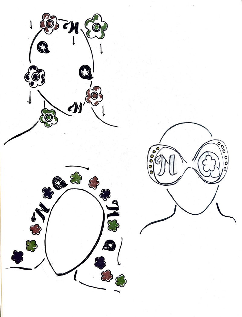
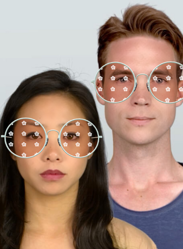
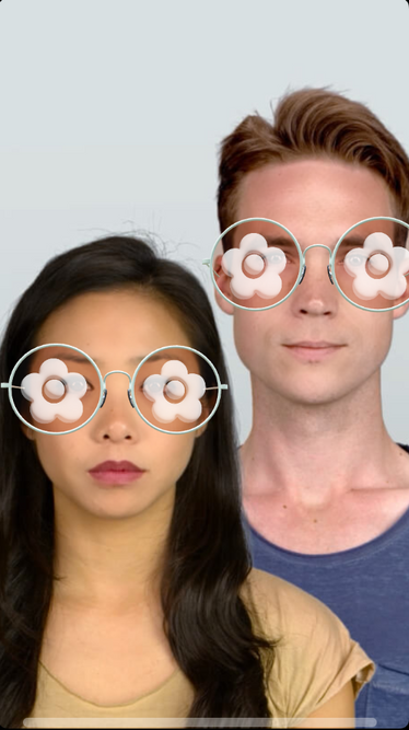
- This filter would include all key icons of the Mary Quant rebrand, with these icons falling in-front of the users face, so their face can still be scene and the brand icons are obvious, and clear.
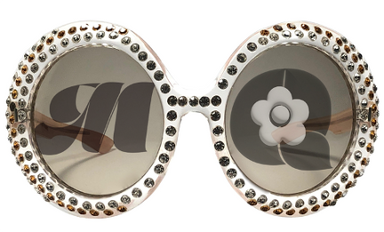
- This filter plays on the previous idea from the launch party invitations being a pair of retro sun glasses, with the brand icons/logo on the lenses, in this particular design this is the M and Q of Mary Quant. I would like these glasses to have a retro, perhaps orange tone or some sort of glitter involved.
- This final design will travel around the users head, this also includes the same icons, in the key colour scheme that reflects the Mary Quant rebrand. To all these filters there could be adjustments with makeup, in a 1960s/70s fashion.
Next step to bringing the AR filter to life:
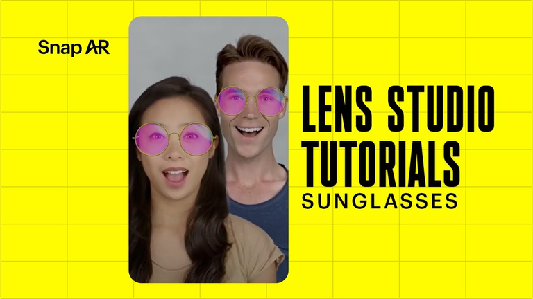
- Experimenting with lens studio, getting used to the software
- Picking a design to replicate,
- Adding some extra brand touches
- Getting my target market group to test out the filters, getting feedback.
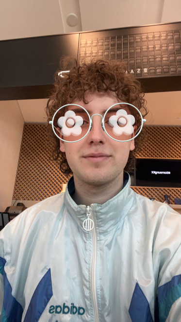
Developing an AR filter using Lens studio
Practical Skill
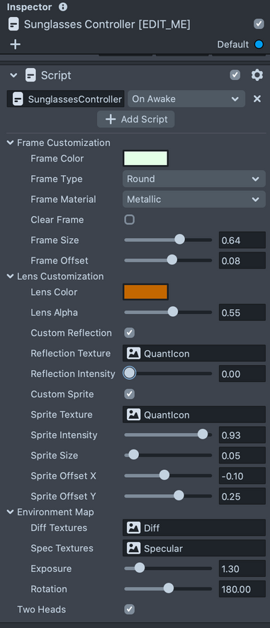
I used the sunglasses template on Lens Studio to create my filter, this was a great way to ease me into using Lens Studio since I have never used it before. I found the controls easy to use and stuck to a simple design, the outcomes looked really successful, but the one at the top did not work well in practice since only one of the small flowers showed, however when asking friends for feedback they actually said they preferred the one small flower since you could still see your eyes through the design.


Ifan trying the filter and feedback....
Evaluation | Reflection
week 5
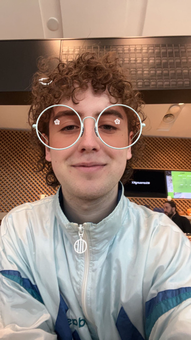
Ifan enjoyed the filter and thought it fit the brand well, he preferred the smaller flower, but thought the bigger flower could also work well if the flowers were slightly smaller and fitted the glasses better.
Taking the filter forward
- Put the name of the brand in so the filter can be easily recognised
- Change the glasses according to the feedback
- Using the glasses to promote Mary Quant and seeing if this gets any attention.
Production and planning
Problem Solving
Designs for Marketing Campaign
cinema 4d moodboard
Planning and Production
Photos not my own- varying sources from Pinterest.
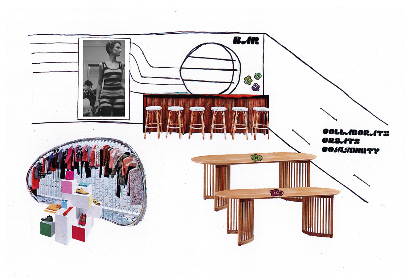
First section of store
Problem Solving | Practical Skill
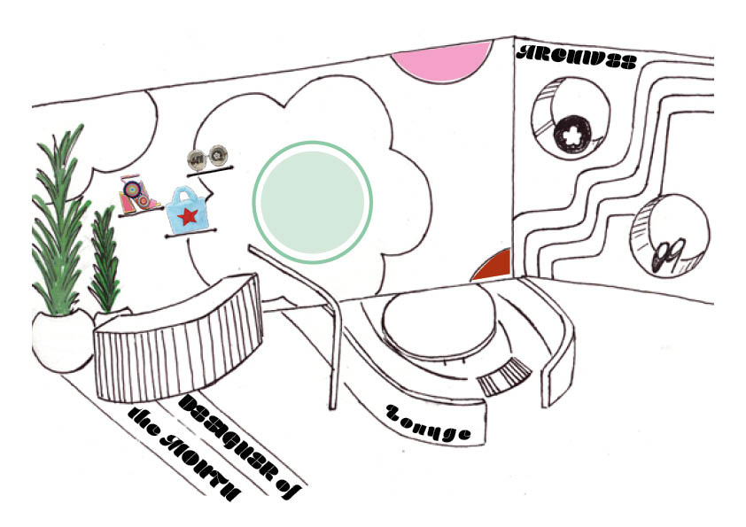
- Wall Graphics
- Mary Quant Arhcive area
- Lounge area
- Selling station for London based designers to rent
- Collaboration area
- Bar
- Display for current limited edition collection
I am really happy how this final design/ sketch turned out, it is clear what will be involved in the flagship store and how the store will meet my brief of creating a creative community for women in the city to collaborate and empower each other the way Mary Quant used to empower women with their clothing.
Mock up for website to be developed
Practical Skill | Development
Posts for instagram
Practical Skill | Development

I wanted to make sure that I create content for instagram since my previous survey showed this was the most used social media in terms of finding fashion inspiration and is the most used platfrom for 18-25 year olds.
Here are some examples of how I would tease at the rebrand and introduce the new direction of the brand as well as the new icons and logo and font. I was given feedback that the I should experiment with changing the font colour on these photos.
Mock ups for potential poster
Development
I created this poster as an option that has a cleaner more minimal effect however I decided that this not not stand out and may not have a big impact if it was seen on billboards or in shop windows, therefore I wanted to go for a maximalistic vibe within the campaign photos.
ways of physically Promoting
rebrand and stores
The instagram posts and the VR filter are a way to promote the brand online to the younger generation, but I also wanted to do some physcial marketing around public areas, near wear the flagship store would be, and one idea was to hand out vintage seed packets with the Mary Quant logo and imagery on. This not only raises brand awarennes but will also encourage people to start their own garden, reflecting the playfulness of the brand and the brands links to flowers and the flower power of the 60s/70s.
I really wanted to create something physical for the customer, since a lot of brand keep their marketing to purely online and therefore loose touch with the clients that want an in person brand experience. I want to make sure that my customers can have something they can feel from the brand, I want this to be something quirky and playful that fits the brand, something not regularly done with a viral quality.
Problem Solving
After getting feedback from peers and tutors about the mock ups, I am going to make a few changes according to their advice. I am going to have a look at developing the graphics to make them more clear, and less intricate, to help when printing the graphics. Since the new graphics and colour way really pop I was told the images edited in a vintage way take away from these and I should seek to make the images vibrant to reflect the graphics and make the the rebranding campaign coherent in its visuals.
I need to develop my cinema 4D space that will represent the store.
I also want to reflect on the death of Mary Quant recently, and understand how my project will help to raise awareness of what she did for fashion and why the brand is a strong brand to rebrand, and the empowerment the brand can bring for women, especially in creative industries.
Evaluation | Reflection
I reflected on my other posters I wanted to make sure the campaign posters were bright, colourful and really reflect the playfulness of the brand.
I used both my illustrations and the Mary Quant typeface and icons to create a busy and vibrant poster.
I wanted the posters to be different but clearly part of the same campaign which I think I have achieved in these images. I want to re edit my photographs to see if I can make them brighter to reflect the new modernness of the Mary Quant rebrand.
Problem Solving
These are new campaign posters, using imagery that I have made to be brighter, after getting feedback on the original campaign photos.
Problem Solving
Working on cinema 4d
Practical Skill
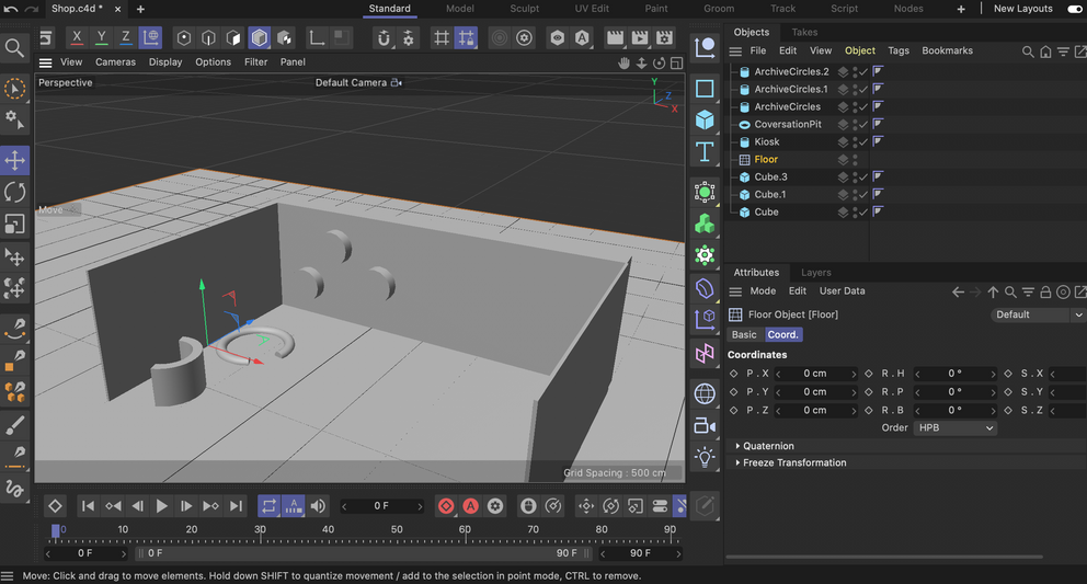
I followed videos on youtube to try and understand how to work Cinema4D since I was not used to the programe in this format which was a different format to which I have previously used. I was able to overcome this partly through watching tutorials but more helpfully talking to my peers who are more experienced in the program. By talking to people about how to work certain commands and how to add my own images and obj. documents really elivated my 3D space and made it look like my drawings and how I intended it to look.
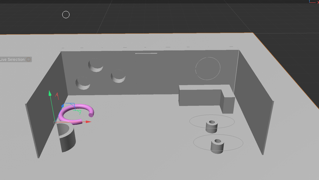
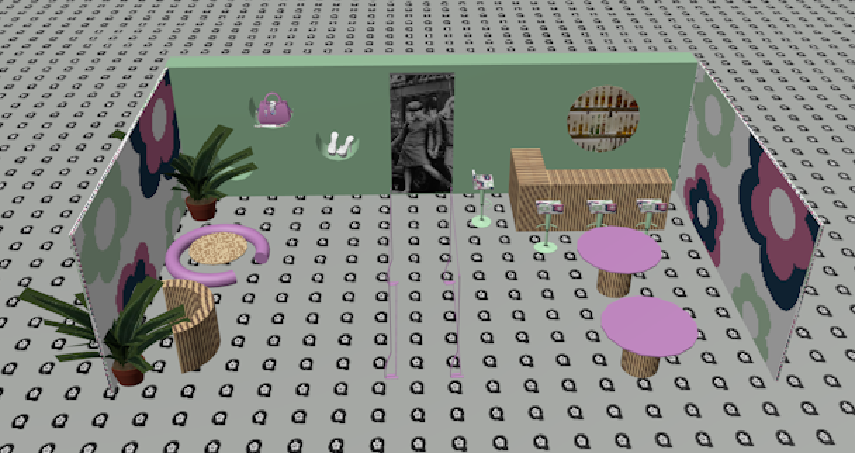
I started the cinema4D representation of the physical store but using three cubes to create three walls of the shop, so I could look at it from all angles. I used the 3D shapes in cinema4D to copy the shapes of objects in my final sketch of the project. This helped me to understand which parts of my store I can create and which has to be dropped in through Free3D. .
Practical Skill
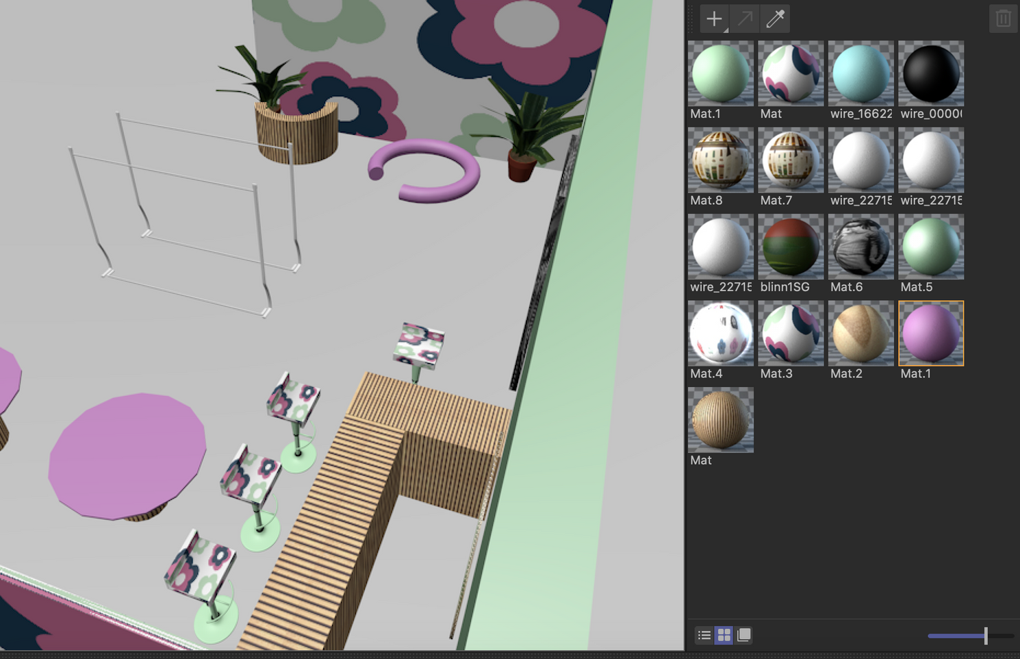
Here you can see that the 3D space is coming into shape, with all the areas marked out and reflecting the different areas of the shop. At this point I have to add all the different materials to really make the shop reflect my drawing and how I want the shop to look.
I wanted to create feature walls with daisies on them, at first I used the 3D daisy logo but didnt like this effect so I took to indesign to create a new design for the walls.
Practical Skill | Development
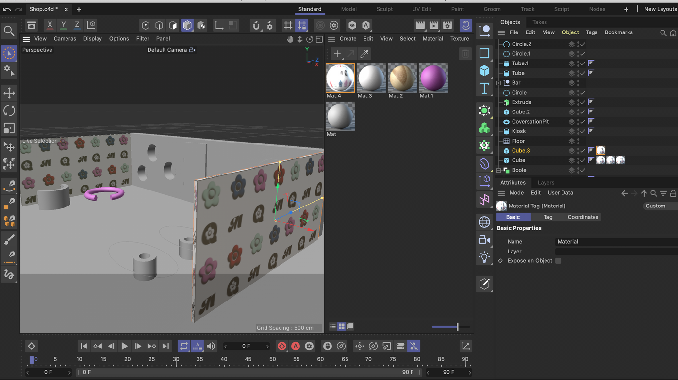
Here i figured out how to make materials and started experimenting how to do this, I figured out how to add my own images to a material which is how I made the walls the Mary Quant pattern, however I later developed these.
Practical Skill | Development
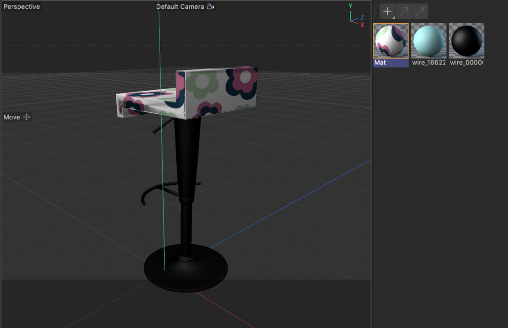
Here I used the free3D website to download objs such as this chair that I was able to change the materials of. Around this time I started to get more comfortable with the program and could really see it coming together.
Practical Skill | Development
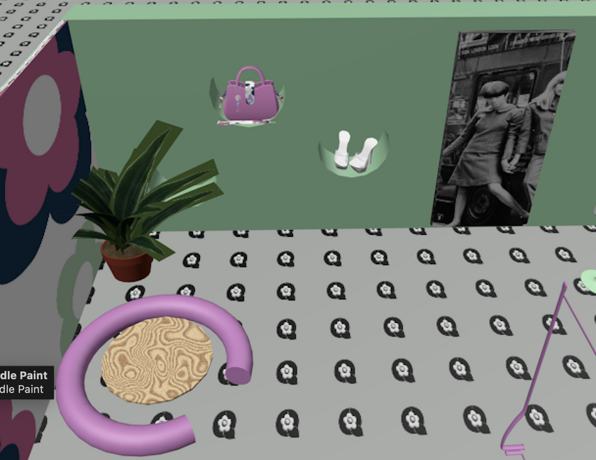
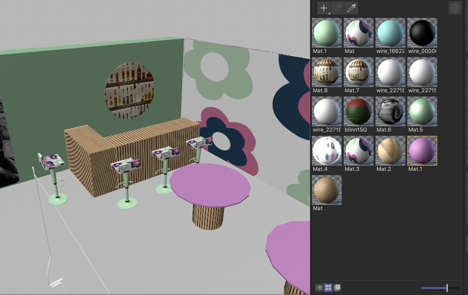
I added the objs of the handbag and shoes to the archive section, which elevated the 3D space, and really reflected by drawings. Again I used the website free3D that i was advised to use by a peer who is more familiar with the program,
Practical Skill | Development
The final element I added to the design was the Q patterned floor which finsihed the 3D store. I like the business of the pattern since it works well with the big flowers on the walls and gives a maximalist effect. I also added the photo of alcohol bottles to the bar area which made the bar look even better, I could see the 3D space coming to life.
Pattern for shop walls
Problem Solving

I think the second wall pattern fits the store more and compliments it, the other wall looked as if it was pushing the branding too much and was in your face.
final Graphic changes/ Development
Development | Problem Solving

In feedback I was told that the M in the Mary Quant logo in particular is hard to read and when enlarge will be hard to use commercial on clothing or in a space such as the flagship store. Therefore I went to illustrator to get rid of the thin line running down the M and make the logo more of a block that could be easily understood in commercial use.
styling board
Feedback from a group crit lead me to want to take more campaign photos to have more content for the website.
i wanted this to be a bolding styled photoshoot with bright colours and a hint to the 60s/70s whilst still remaining modern.
Development | Planning
posing board
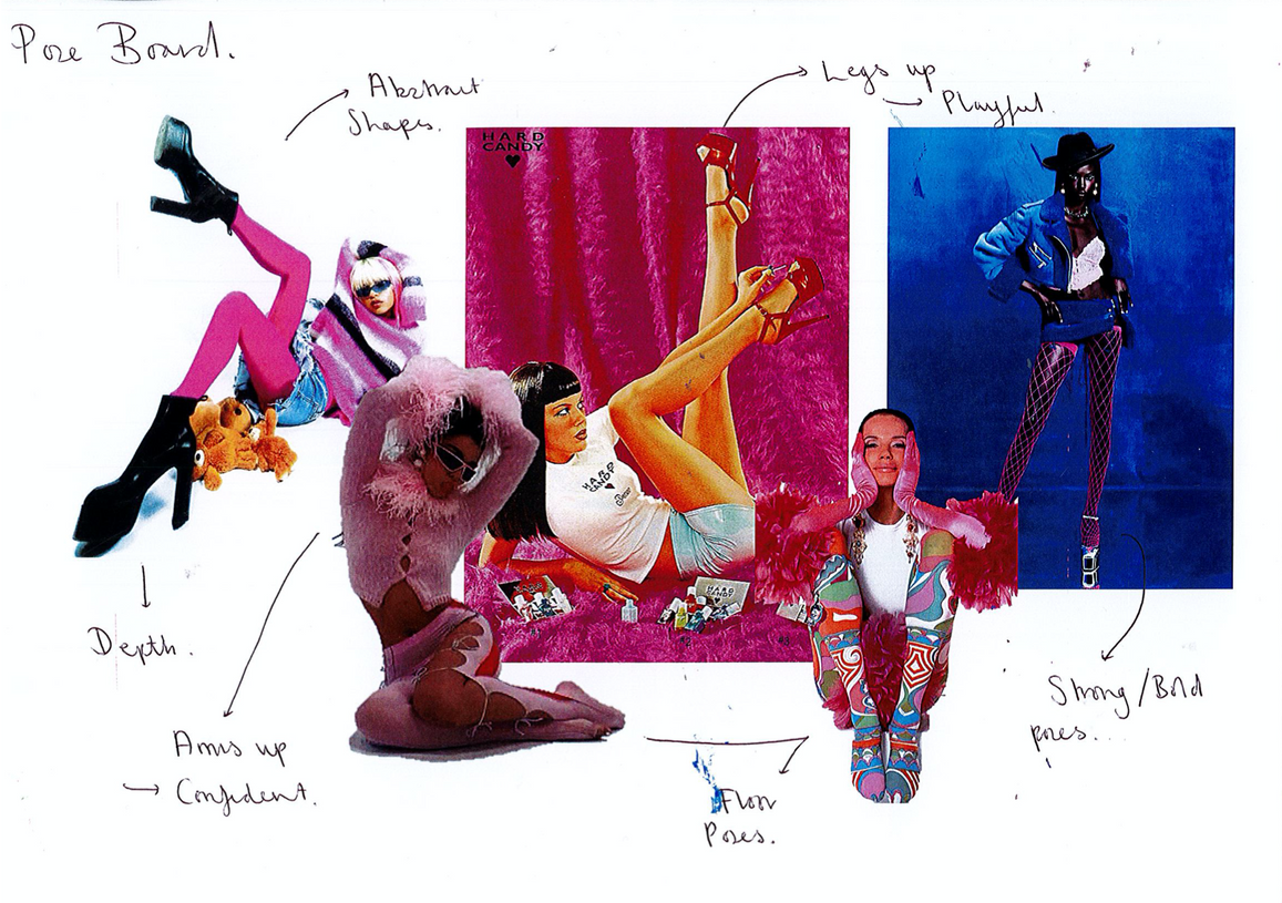
I think having a pose board was crucial to why the shoot was successful. it meant that both the model and photographer could understand the angles I wanted and could deliver. the model felt better knowing that there were references right in from of her.
Development | Planning
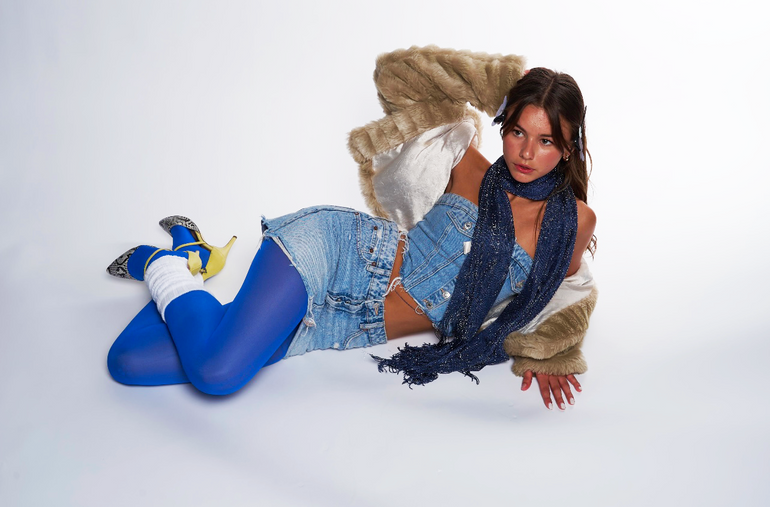
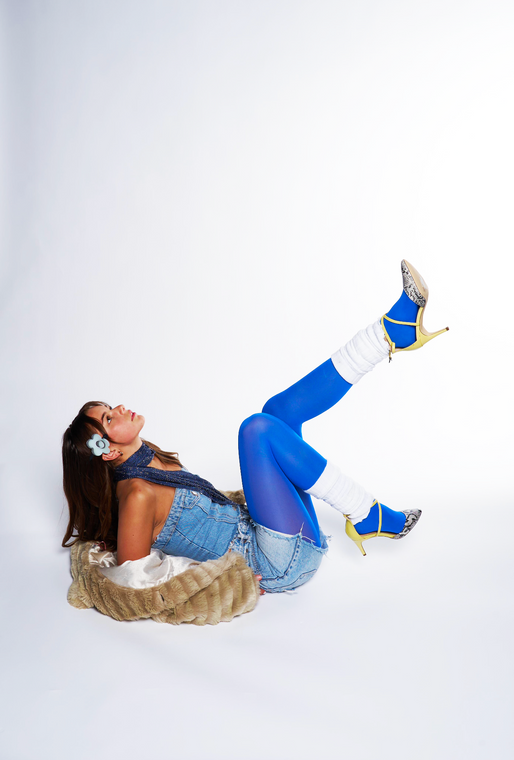
Styling
Development
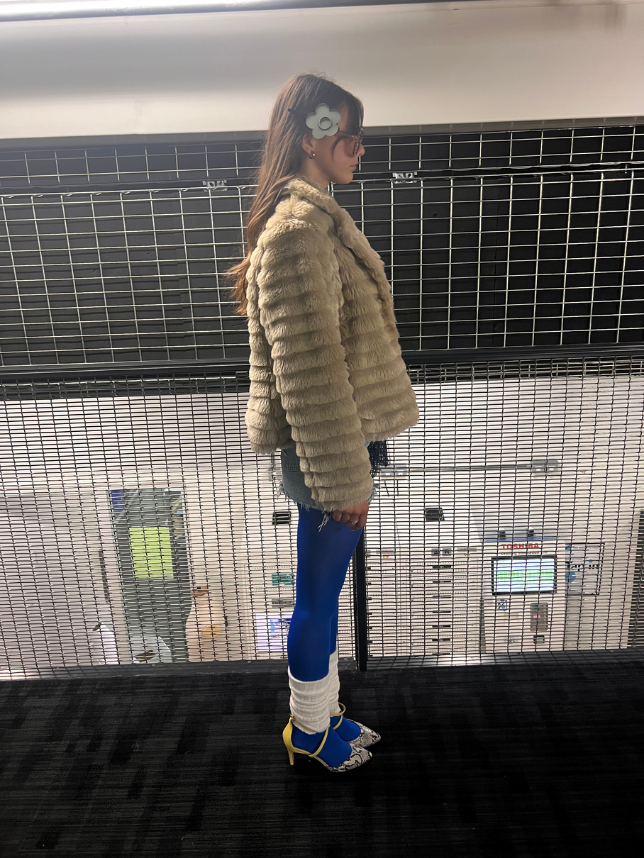
I am really happy with how my styling turned out as this is not always my strong point, I think the outfit captured the brand well and communicated what I was looking for through my concept boards.
I also made some accessories for the model to wear that could be sellable on the website, and hinting further at the brand graphics.
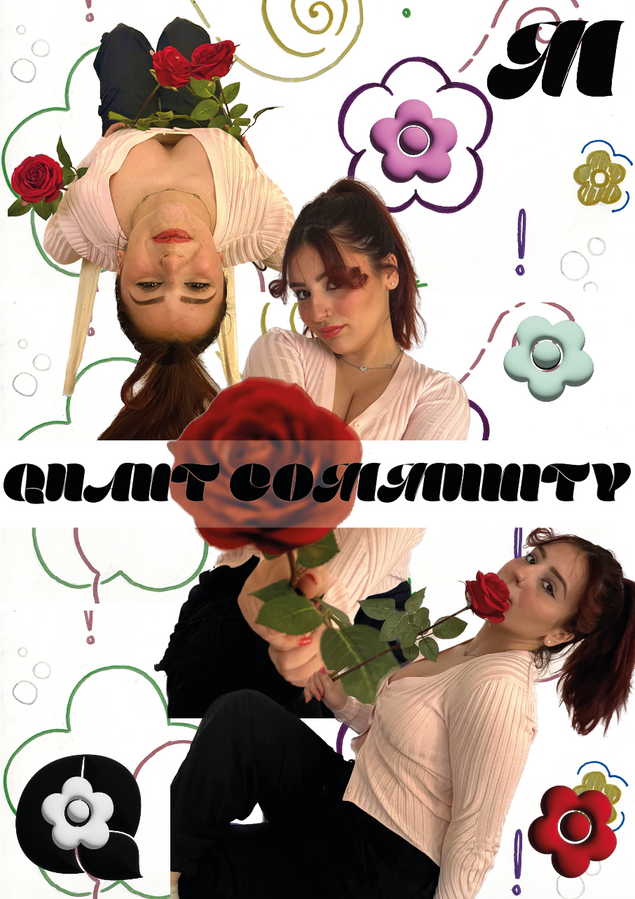
Photos from shoot
Development | Practical Skill
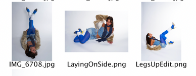
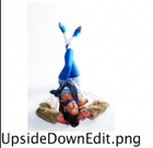

(I did not take these photos)
These are the raw images of my, these turned out really well and I instantly knew I could edit them well to fir the brand even more.
I loved the range of poses that were captured, which gave more opportunities in terms of an interesting and eye catching campaign photos.
Directing this shoot went successfully which I think was a result of my planning and clear vision of how I wanted the styling and images which was able to be understood by the model and photographer through my styling and posing boards that can be seen above.
Practical Skill
Saturation, Brightness, Vibrancy and Contrast increased.
For this campaign poster I put the daisy pattern in the back as a back drop to add a playfulness to the photo, the M and the Q logos for the branding of the photo, this would not be the primary poster sign the full name is not included.
For this campaign poster I took advantage of the models pose to make the model look as if she is looking at the branding above, again only the MQ is used so this poster wouldn't be the main campaign photo.
Practical Skill
Campaign posters
I wanted there to be a poster that had the brands full name on to make sure the audience is clear on which brand is in-front of them. I like this poster due to how the branding is used as the background of the photo, which again reflects the playfulness of the brand and still allows the styling and colour of the clothes to stand out and take centre stage.
Website development
Development | Practical Skill
I think there is an obvious improvement between these two images in terms of how they represent Mary Quant as a brand, the first layout is not eye catching and doesn't leave a lasting impression.
The second photo uses branding well and instantly catches the audience.
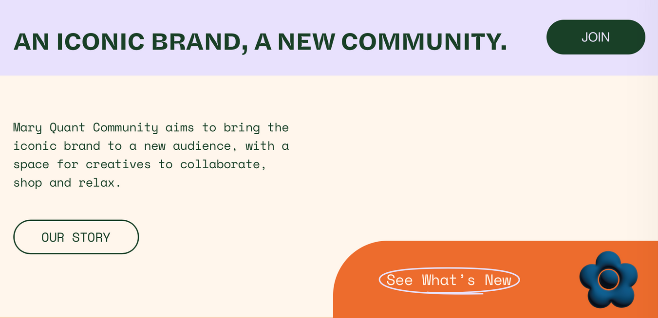
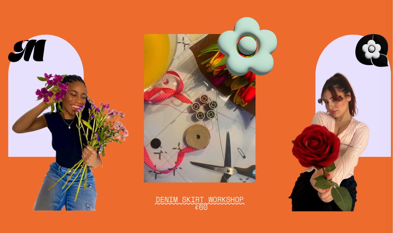
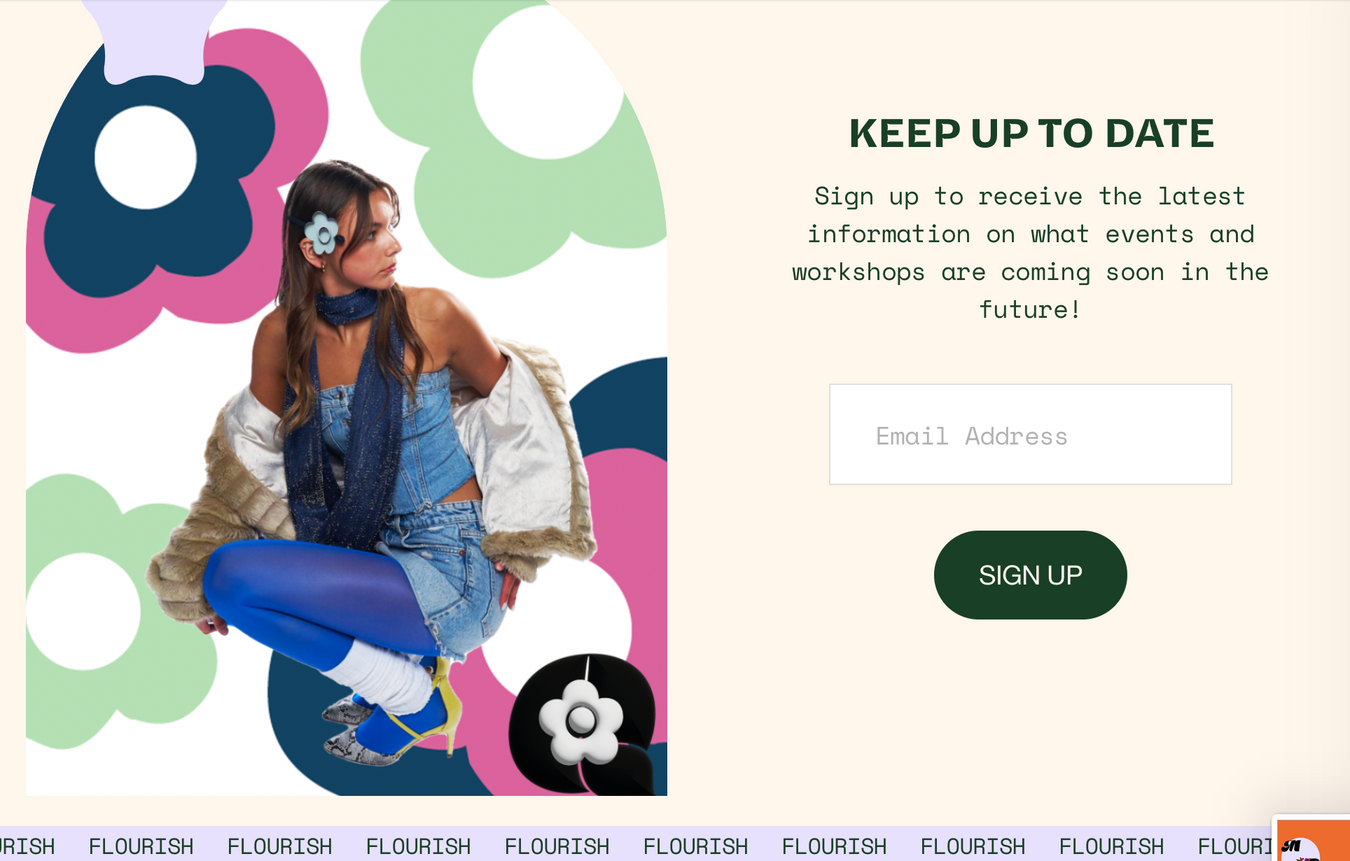
Here is the finished website for Mary Quant, including the most recent campign photos edited, as well as making use of my other. The website is fun and playful and informs the user on the purpose of quant community.
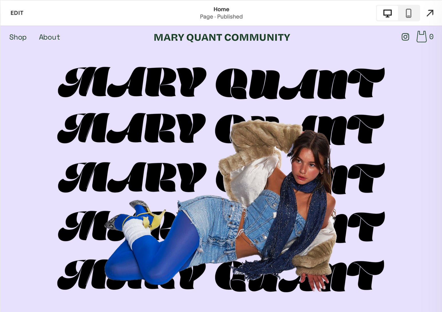
FInal Website
final evaluation of website
Reflection
Due to not being able to buy a squarespace subscription my live website cannot be accessed however above you can see exactly how it looks.
My website reflects the brand in its colour scheme and images, as well as the use of shapes as an added element of design.
I think it was a great decision to do my last minute photoshoot since before my website seemed lacking in content and I had to be reusing the same images, I was really happy with how I was able to pull a shoot together in a short period of time and that its made my project feel more put together.
I think my website provides the user clarity on the rebrand and the return of Mary Quant.
If I was to do the website again I would maybe add a product section which could link to the main page and explain in more detail what events and limited edition collections are coming up. This wasn't possible since it wasn't an option on the programme which I was using which was SquareSpace,
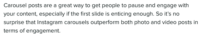
Instagram Carosels
Development
Zote, J. (2022). How to Make a Seamless Instagram Carousel Post. [online] Sprout Social. Available at: https://sproutsocial.com/insights/instagram-carousel/.
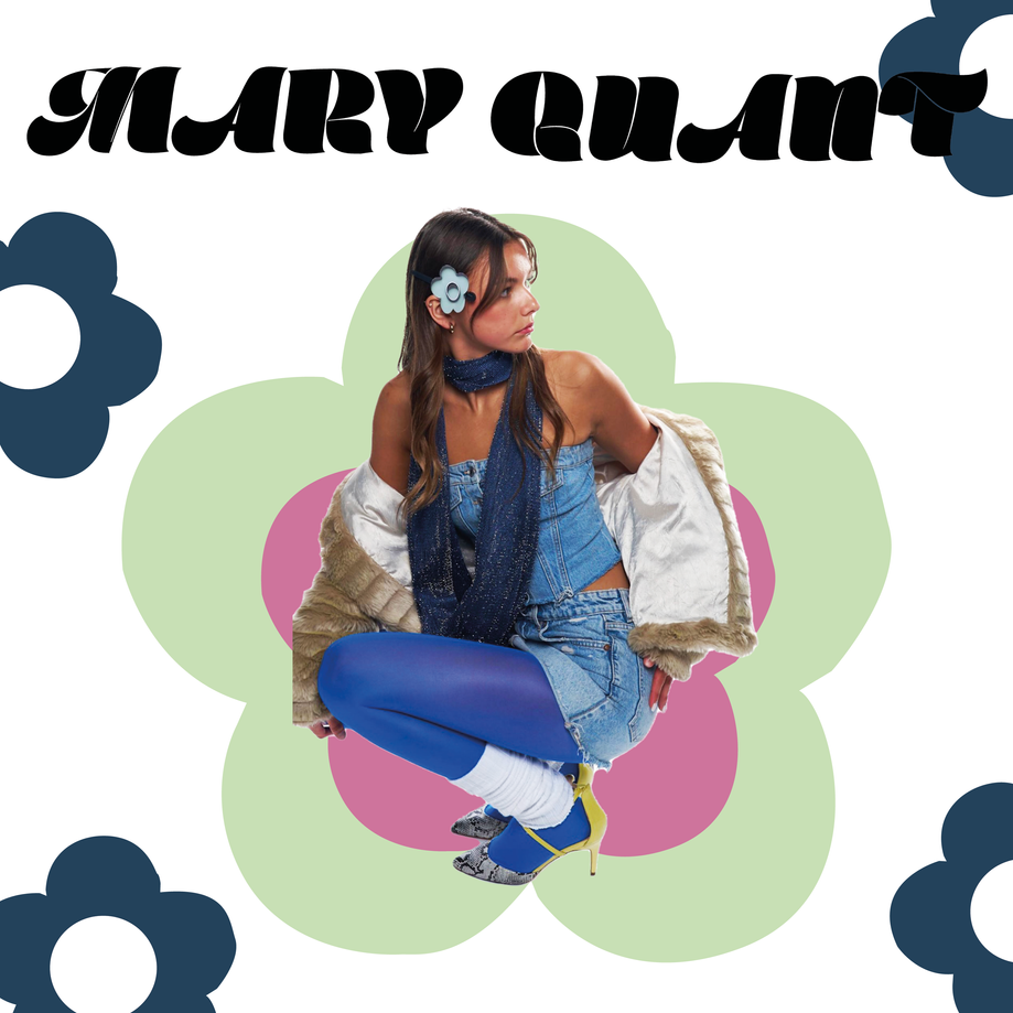
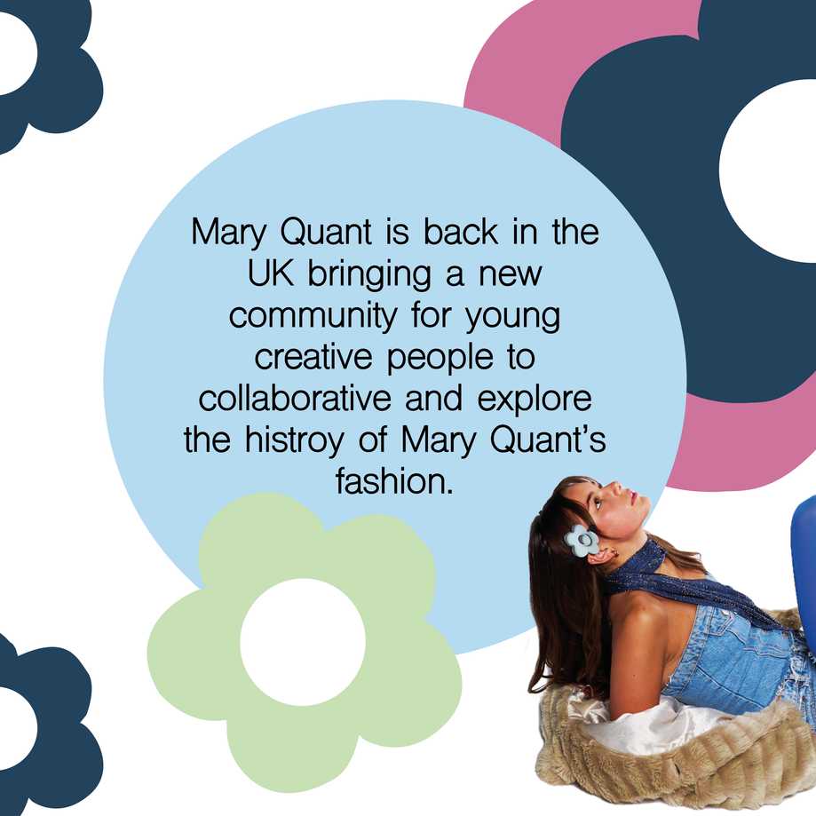
Practical Skill
I am happy with how my instagram carousel turned out, it is bright, playful and gives key information about the brand that may not be obvious. I really like how the cut outs of the model added to the carousels and looked good when you could swipe through the posts.
Practical Skill
evaluation of 3d model
From having little experience of cinema 4D as a program and having to fugure how to get a high quality outcome, I am proud of the final outcome and how well it promotes the brand. having hte 3D representation of the space creates a deeper understanding of what the flagship store was to look like if it was to actually be produced. Instead of using cinema 4D to represent the meta verse as it is often used for virtual reality, here it is used to represent an interior that would be a physical space.
my favourite parts of the 3D space are the spaces that I have customised to include the brand prints, making a consistant them recognisable within the space.
If I was to do this again I would perhaps make the space bigger to show the different areas more clearly.
Reflection
Bibliography- rebranding Mary Quant
Reference list
23Layers (n.d.). 23 Layers | Event Planning NYC - Glossier All Company Dinner. [online] 23 Layers | Event Planning NYC. Available at: https://twentythreelayers.com/gallery/glossier-company-dinner/ [Accessed 30 Apr. 2023].
Altman, C. (2021). Modern, Middle-Class, and À La Mode: inside Britain’s Mod Movement. [online] All That’s Interesting. Available at: https://allthatsinteresting.com/the-mods.
Dan (2022). Top 8 Marketing Strategies for Your Fashion Brand. [online] Digital Agency Network. Available at: https://digitalagencynetwork.com/top-8-marketing-strategies-for-your-fashion-brand/.
Demars, G. (n.d.). Silk Sonic & Spotify Present ‘The Silk Room’. [online] www.youtube.com. Available at: https://www.youtube.com/watch?v=ebqrI6w4Nzc [Accessed 30 Apr. 2023].
Hughes, D. (n.d.). Is Mod Still Mod Or Is It Just Another Throwback? [online] RebelsMarket. Available at: https://www.rebelsmarket.co.uk/blog/posts/is-mod-still-mod-or-is-it-just-another-throwback [Accessed 30 Apr. 2023].
J.Teji (2022). Best Instagram AR Filters November 2022 | TEJ | Augmented Reality. [online] TEJ. Available at: https://tej.ie/best-instagram-ar-filters-november-2022/ [Accessed 30 Apr. 2023].
L’Officiel USA. (n.d.). 8 Major Fashion Rebrands to Know. [online] Available at: https://www.lofficielusa.com/fashion/fashion-rebrands-designer-changes-burberry-gucci-saint-laurent-celine.
Nast, C. (2023). Burberry’s big return to British eccentricity. [online] British GQ. Available at: https://www.gq-magazine.co.uk/fashion/article/new-burberry-daniel-lee-2023.
New Face Digital (2023). 5 Best Branded Instagram Story AR Filters of 2021. [online] New Face Digital. Available at: https://newfacedigital.co.nz/blog/5-best-branded-instagram-story-ar-filters-of-2021.
Panel, E. (2019). Council Post: Seven Marketing Strategies For Reaching Younger Customers. [online] Forbes. Available at: https://www.forbes.com/sites/forbesbusinessdevelopmentcouncil/2019/01/23/seven-marketing-strategies-for-reaching-younger-customers/.
Pemberton, B. (2015). Inside the glamorous TWA terminal at JFK - a preserved capsule to 1962. [online] Mail Online. Available at: https://www.dailymail.co.uk/travel/travel_news/article-3150949/Frozen-time-Inside-space-age-TWA-terminal-JFK-built-1962-soon-turned-boutique-hotel.html [Accessed 30 Apr. 2023].
Quant, M. (2018). Quant by Quant : the autobiography of Mary Quant. London: V & A Publishing.
Sutherl, E. (2020). Step inside Adidas’s new ‘hyper-local’ flagship store. [online] Drapers. Available at: https://www.drapersonline.com/insight/analysis/come-inside-adidass-new-hyper-local-flagship-store.
Taylor, D. (2022). Brand rejuvenation: the fall and rise of Levi’s. [online] brandgym. Available at: https://thebrandgym.com/brand-rejuvenation-the-fall-and-rise-of-levis/.
WASDthechannel (n.d.). HOW TO CREATE A 3D SPINNING LOGO - Adobe Premiere Pro Tutorial. [online] www.youtube.com. Available at: https://www.youtube.com/watch?v=xq0x1yuOAAM [Accessed 30 Apr. 2023].
WMagazine (n.d.). Julia Garner Channels Twiggy in a Mod Mini Dress. [online] W Magazine. Available at: https://www.wmagazine.com/fashion/julia-garner-courreges-dress-twiggy-mod [Accessed 30 Apr. 2023].
YPulse (n.d.). These 100-Year-Old Brands Have Reinvented Themselves to Reach Gen Z & Millennials. [online] YPulse. Available at: https://www.ypulse.com/article/2021/04/21/these-100-year-old-brands-have-reinvented-themselves-to-reach-gen-z-millennials/.
Yuen, S. (2022). From Diesel to Crocs, here are the once-forgotten fashion brands that have successfully made a comeback. [online] Vogue Singapore. Available at: https://vogue.sg/once-forgotten-fashion-brands-y2k-comeback/.
Zote, J. (2022). How to Make a Seamless Instagram Carousel Post. [online] Sprout Social. Available at: https://sproutsocial.com/insights/instagram-carousel/.